October 20th, 2016
ECLECTIC TODDLER ROOM DESIGN
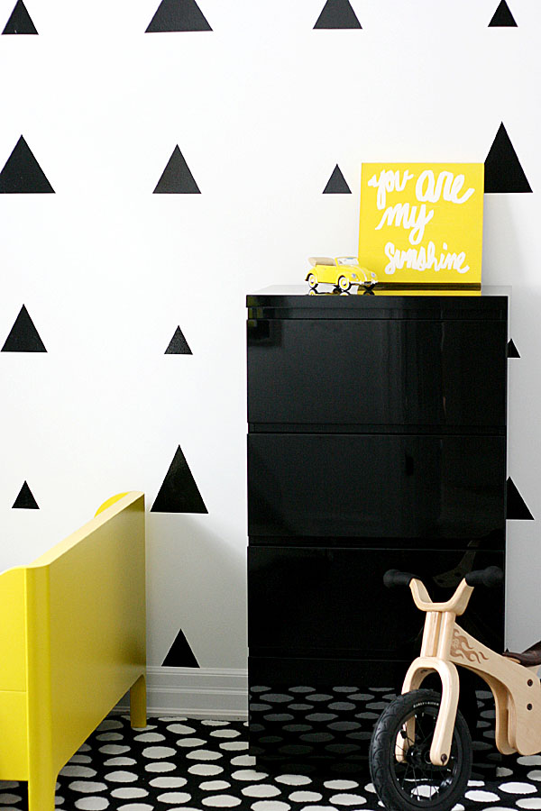
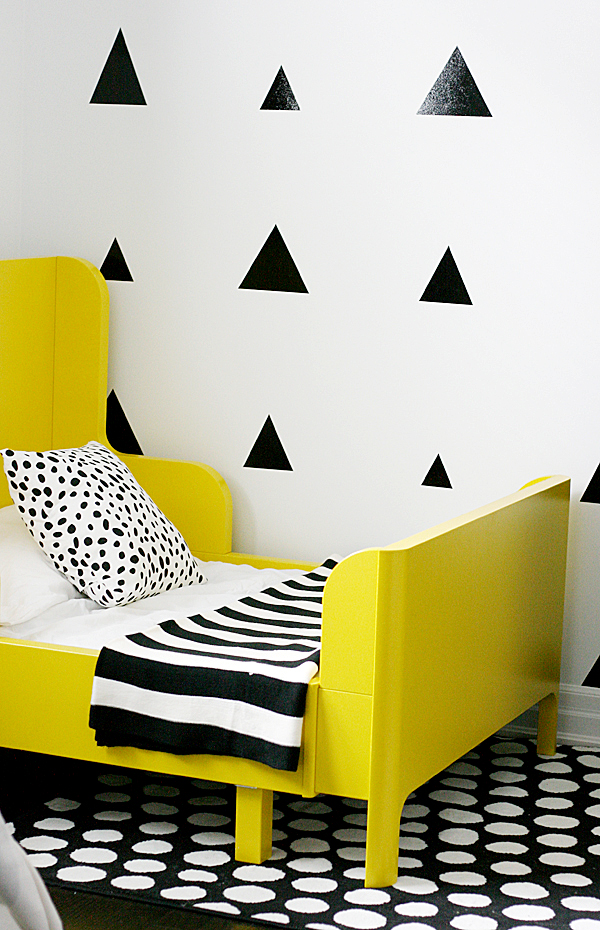
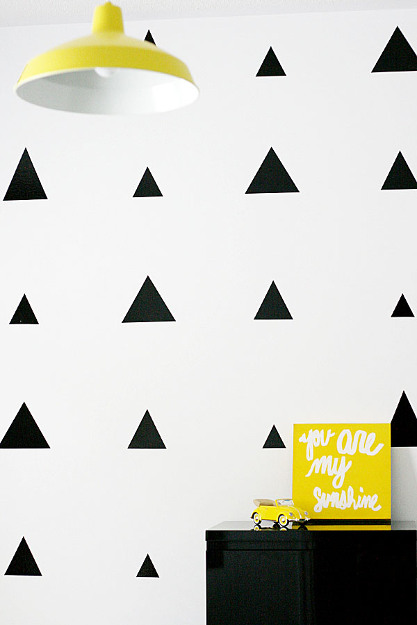
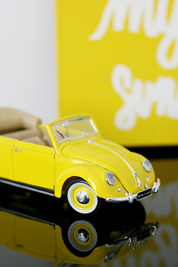
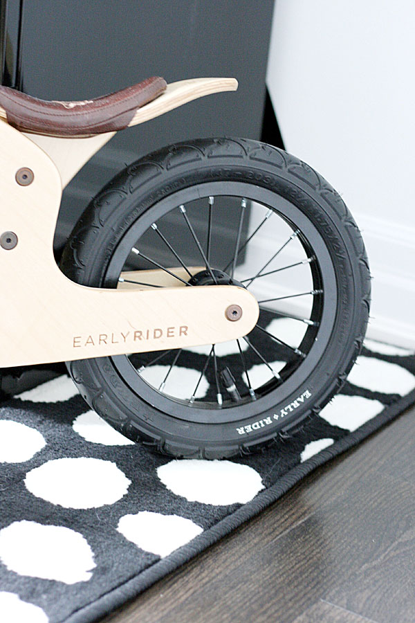
SOURCES l Bed: IKEA (similar) l Rug: IKEA (similar) l Teepee: Land of Nod l Drapes: Homesense (similar) l Dresser: Structube (similar) l Night Table: Structube (similar) l Wall Decals: Side Effect Graphics l Flag Banner: Milk+Bots (similar) l Yellow pillows: Homesense (similar) l Faux fur rugs: Homesense (similar) l Striped Blanket: IKEA (similar) l Dotted Pillow: c/o Tonic Living l Ceiling Fixture: Shades of Light (similar) l Wall Art: DIY l Bicycle: Early Rider l Sunshine Art: Homesense (similar)
Kid’s rooms are so much fun to design because you can really go wild with colour, pattern and never worry about it being too much! (Check out my baby girls nursery design here) I designed this toddler room well over a year ago (see my inspo board here), but am so happy to finally be sharing it with all of you.
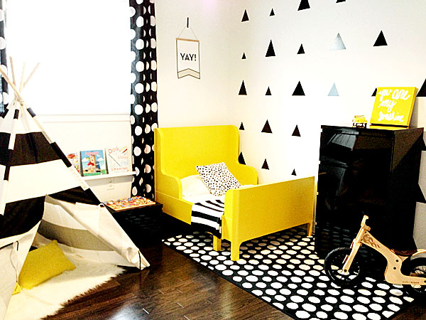
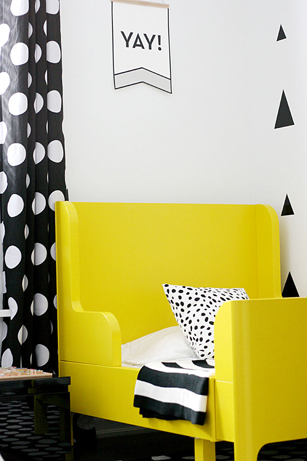
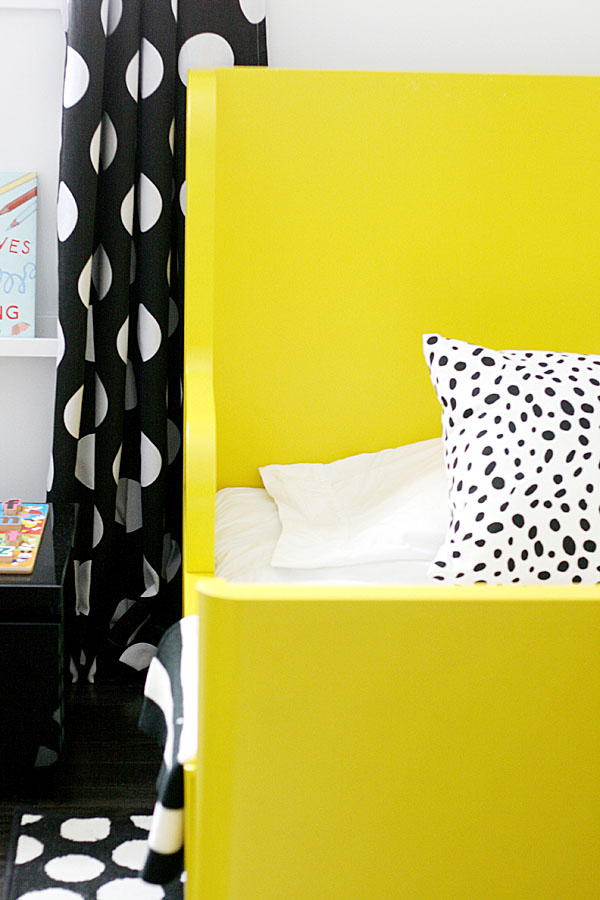
I knew I wanted a really bold and fresh design for my son and something that could grow with him as he gets a bit older. This room was designed with much love and lots of DIY projects. Let’s start with the bed. For my first #ikeahack I chose this adorable little bed that extends 2x from a toddler bed to a twin. The mattress is also extendable which is amazing (and totally cost effective. This bed came in light pink and blue, so I chose the light pink version to easily be able to paint over it. After primer and 3 coats of paint, we achieved the cutest little bed which has affectionately been nicknamed “the yellow bed”. This would also be a great idea for any toddler bed that you love the shape of but the colour’s just doesn’t happen to be what you’re looking for. I also love this one and this one for their flat surfaces which can easily be painted with a roller brush and instantly given a new life.
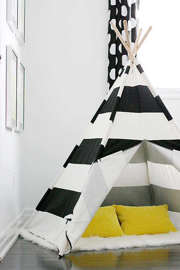
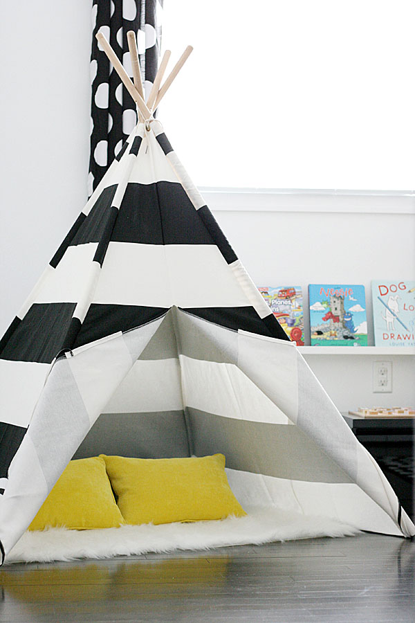
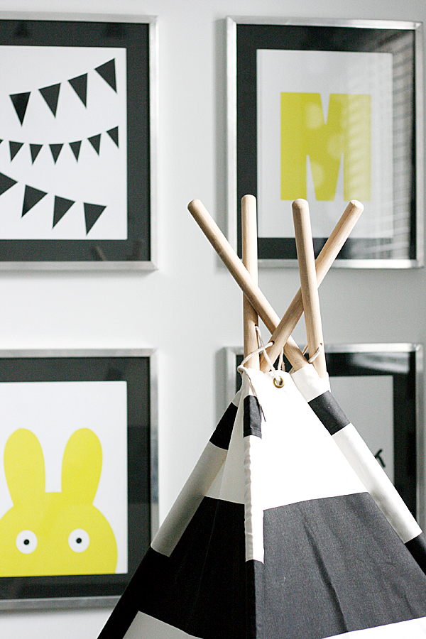
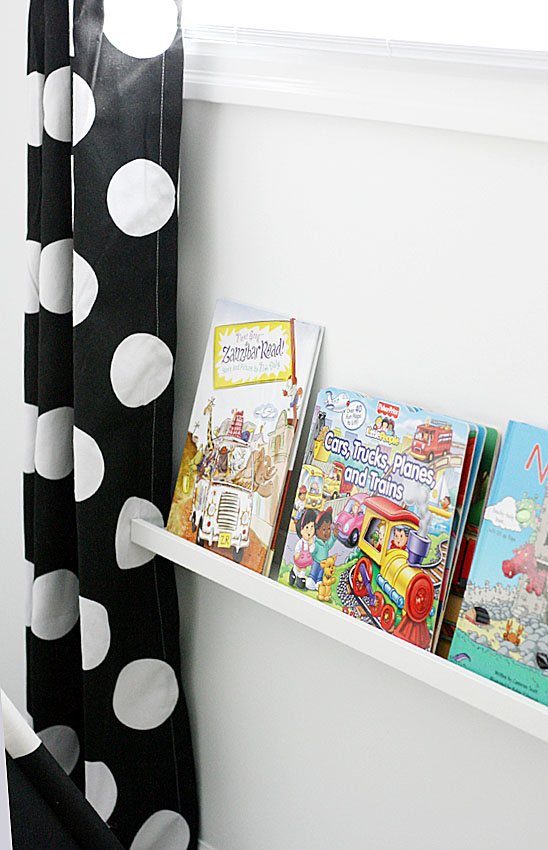
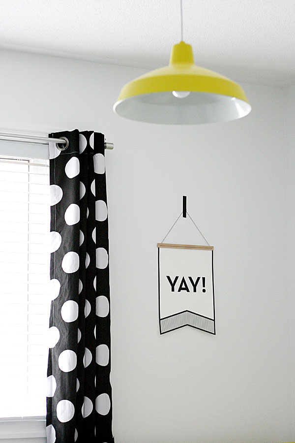
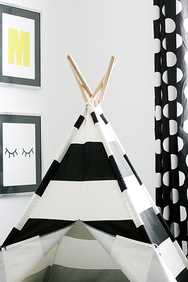
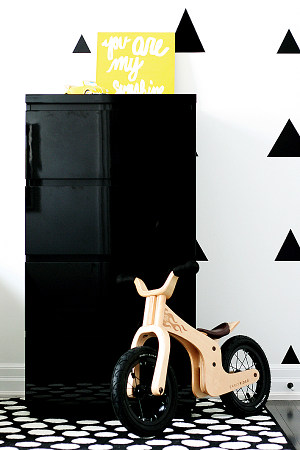
We played with a variety of shapes in this space and translated them into circles in the rug and on the drapes, triangles on the wall and stripes on the teepee. Black and white makes such a bold statement, and adding in a fresh pop of colour (used sparingly of course) makes a space so much fun!
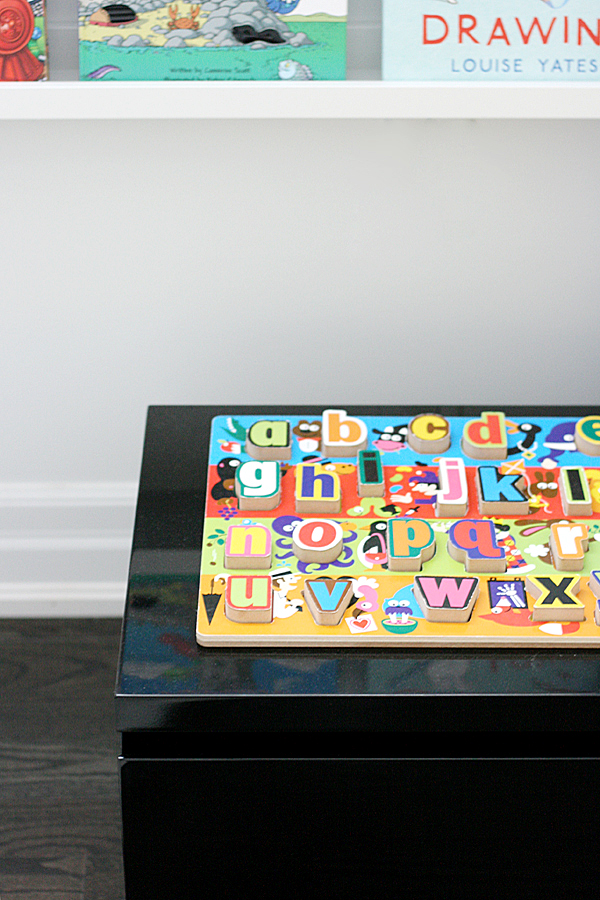
The sidetable and dresser in the room are not kids furniture, and I love how they can grow with Massimo as he gets older and can easily be translated in a teen room no matter what the design plan. I knew I wanted a night table that was low enough to look proportionate to his bed, so this low-profile design from Structube was exactly what I was looking for!
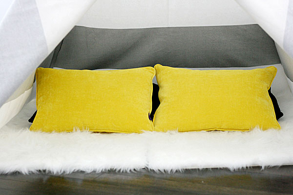
I hope you love the space as much as I do and sometimes I even wish this could be my room (who wouldn’t want all this happy color to wake up to every morning?) A teepee would have been a dream when I was kid, so the fact that both my kids love to grab a book and crawl inside and play hide and seek, makes my heart so happy!


I can just picture Gemma and Massimo laying in the tree reading a book…I love love The colors and designs…Gramps Frank may just fit in there with him..lol..I bet he gets his turn in the tree. .lol..u guys did a fantastic job..☺
In the tree not tree..this crazy phone..lol
How cute is this! I absolutely love the striped teepee. I kind of wish I had a kid just so I could decorate its room lol!
xo
Siffat
http://icingandglitter.com
Simply brilliant