November 20th, 2020
ENTRYWAY REVEAL TAKE II
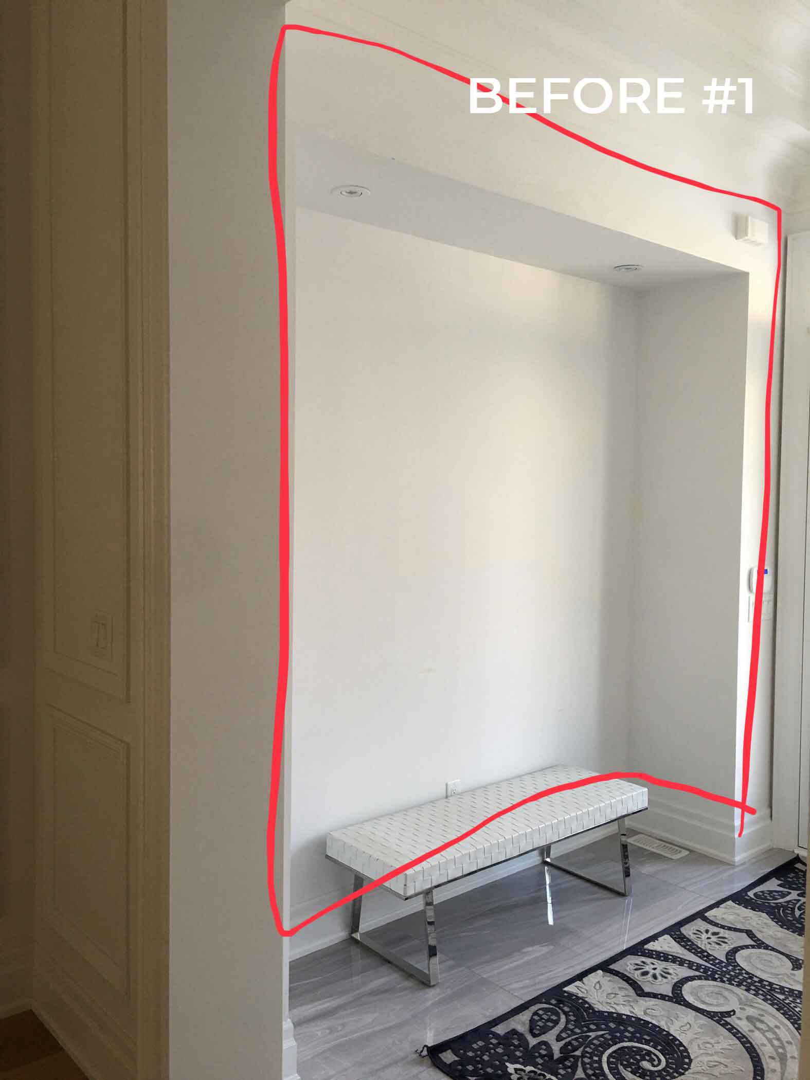
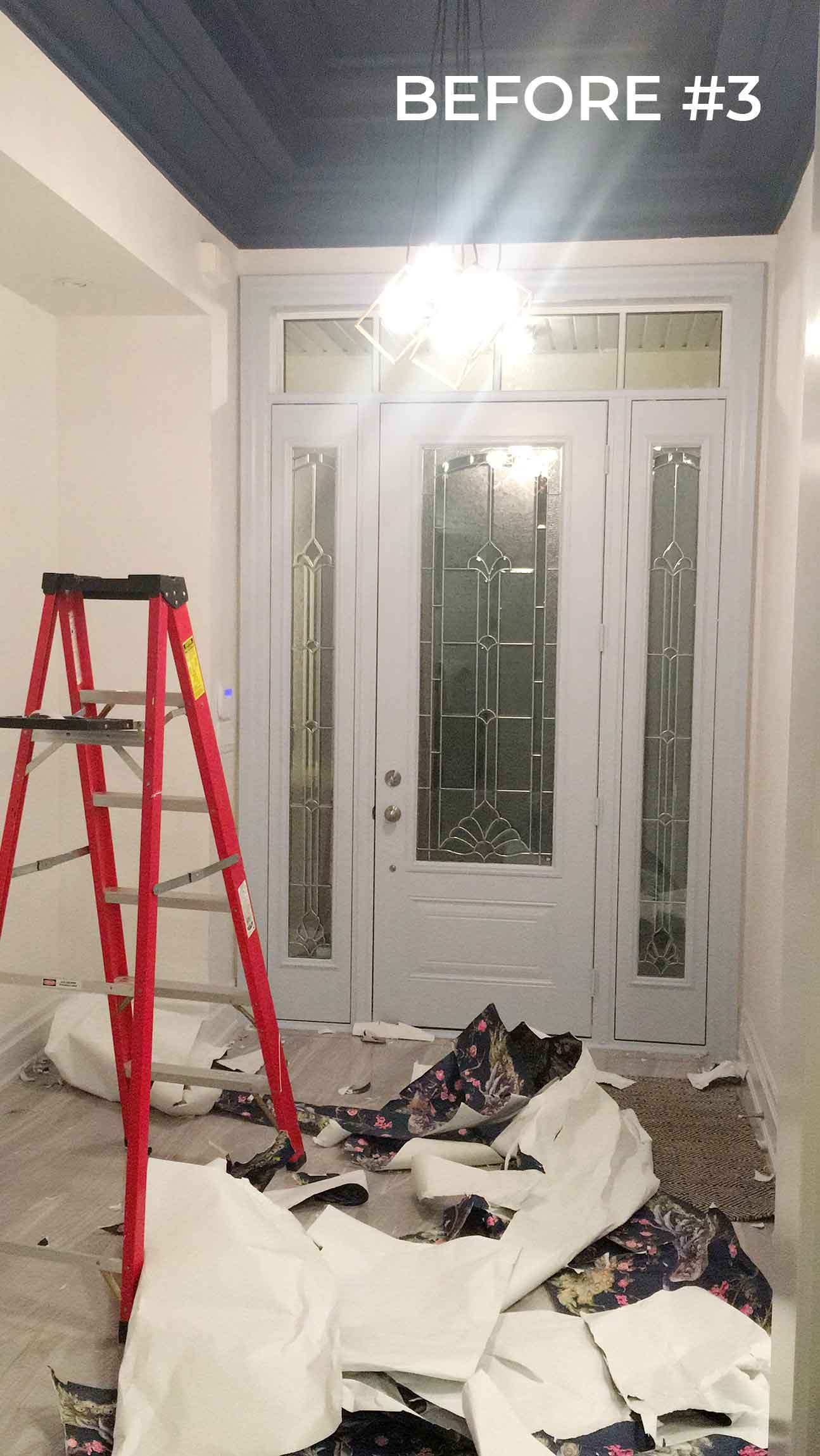 If you’ve been around here for a while you may be wondering why I’m revealing my entryway for a second time. Well, sometimes decor mistakes happen – and my first attempt at our entryway was a huge mistake.
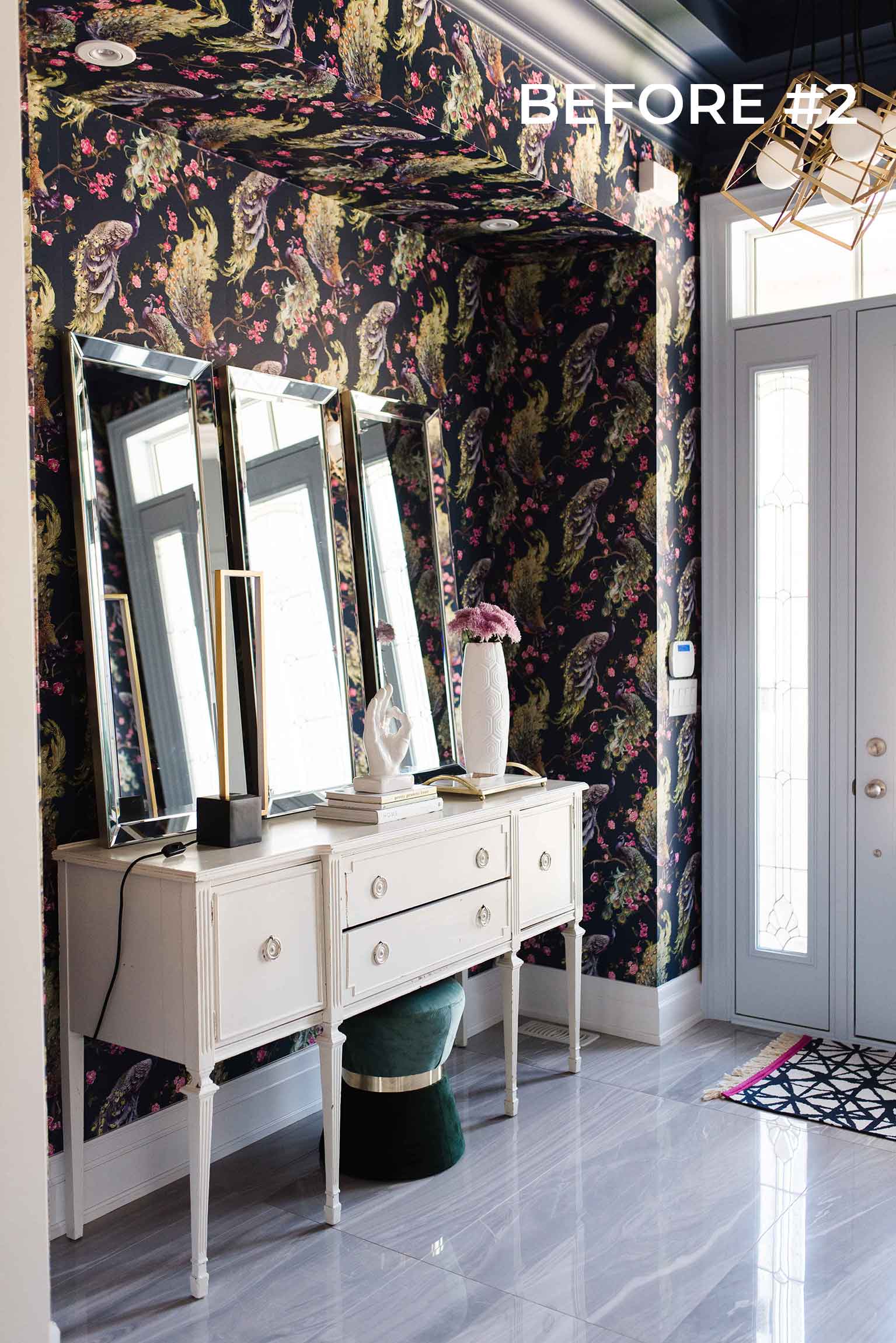
Back in October 2019 I hired a professional to install wall-to-wall traditional wallpaper in our entryway, and while I did love the pattern of the paper – it was way too overwhelming in that small space. Plus the paper really pulled greenish yellow tones which was not the palette I had been going for. A second mistake was that since the space opens right into the dining room – which we had not yet decorated – it was going to set the tone for half of the entire main floor and I did not loving where it was all going.
Needless to say, the wallpaper install cost me a pretty penny so when I decided that it had to come down, I promised my husband I would do all the work myself. Thank goodness he disliked the original paper as much as I did – so it was an easy sell – but not so easy a project to execute! Let’s just say that between December 2019 and October 2020 I plugged along at peeling off wallpaper, patching walls, painting walls (Benjamin Moore 2112-50 Stormy Monday), painting ceilings (Sherwin Williams 7602 Indigo Batik), and the list goes on – all on my own! But the hard work paid off and I’m so happy with how it finally all came out.
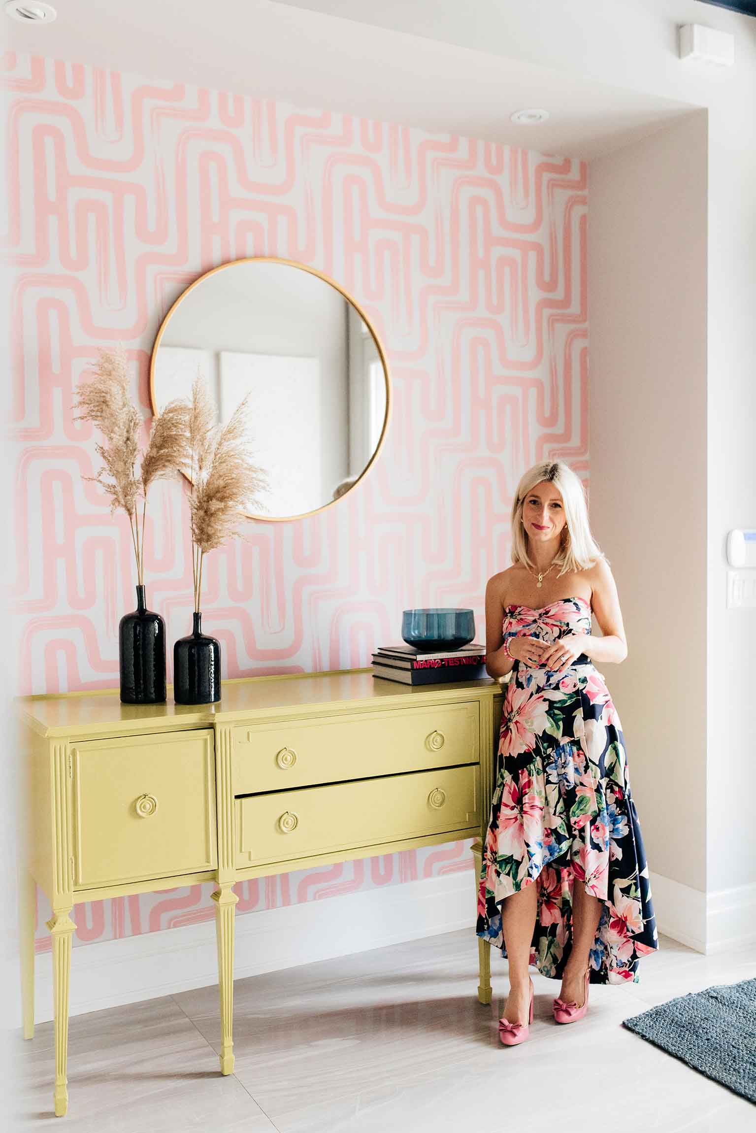
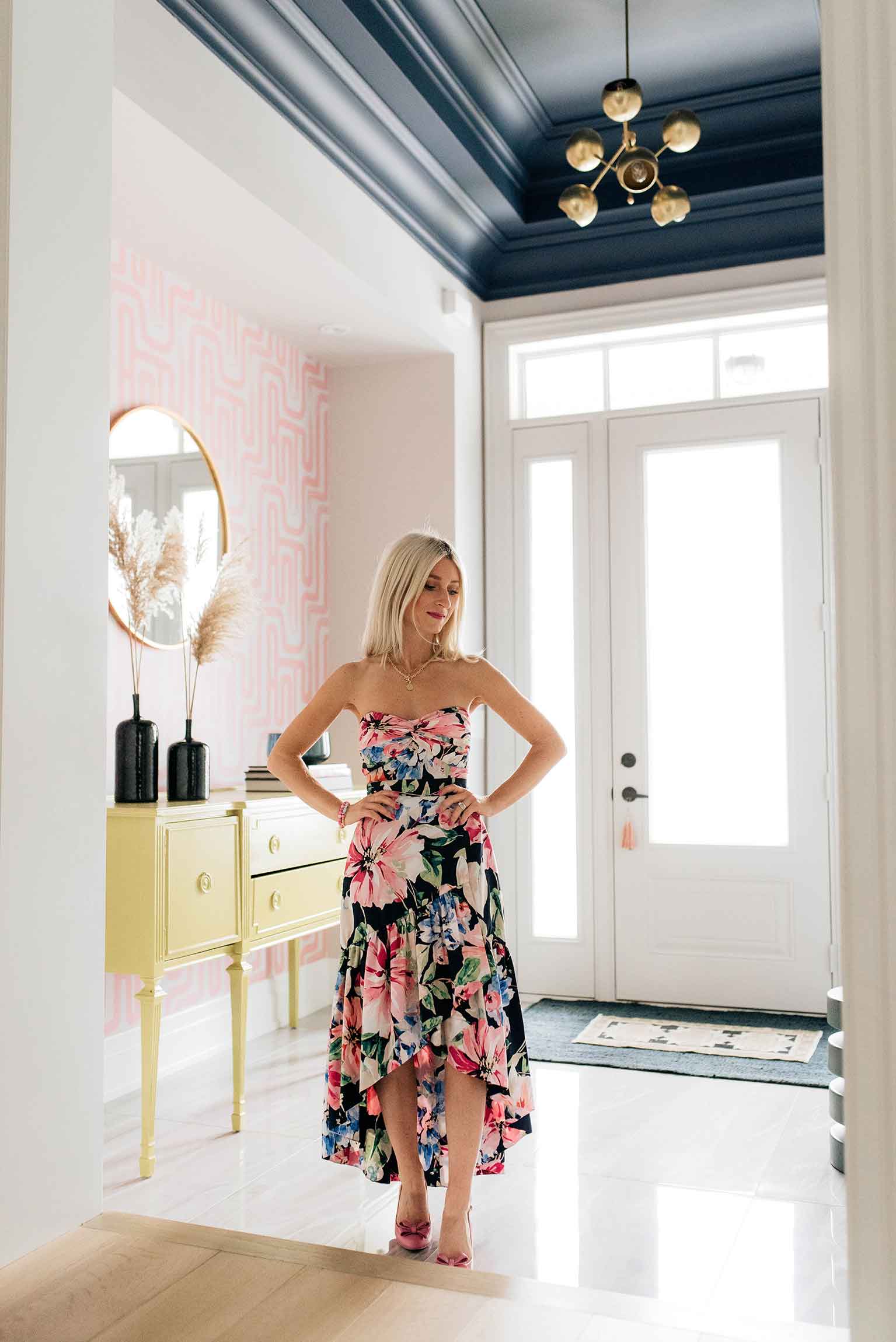 Let’s start by chatting about the new wallpaper from Livette’s Wallpaper that has completely transformed this space from a dark peacock-infested jungle, to a bright, airy, and welcoming entryway. The paper I used from Livette’s was their Neutral Paintbrush Maze Removable Wallpaper in a custom colorway. I have installed removable paper a few times in the past, so I was confident this project was one that I could execute on my own. The paper came in full-length sheets which were simple and easy to install, and since it was constructed of high-quality paper it never ripped or stretched. Pro Tip: When it comes to actually installing the wallpaper, I never trust that my walls are perfectly straight, so I trimmed my first sheet lengthwise when starting at the left corner and measured all the way down the right side with a level to ensure my first sheet went up perfectly straight – and it did! After that, the rest of the panels went up like a breeze and I couldn’t be more happy with the results!
When I was searching for the perfect removable wallpaper to replace the existing one, I noticed that most removable papers had very feminine or childish patterns, and it was quite the challenge to find something that would make a bold, grown-up statement for an entryway. When I discovered Livette’s though – the options were endless, and it was hard to choose just one. I instantly fell in love with the Paintbrush Maze print and love that they have the option of printing their papers in custom colours. I already had a palette in mind for the space, so it was as easy as providing them with the Benjamin Moore colour numbers and the final printed product was matched exactly to my specifications.
The pattern of the paper is so on trend at the moment with its soft, curvy lines and the light pink colour is such a welcoming hue when you first walk in the door. I am so happy that I decided on installing the paper on just one wall – as opposed to the entire space – because it adds a pop of colour and pattern without being too overwhelming. I’m so happy with my choice from Livette’s and can’t wait to use their paper again in future spaces.
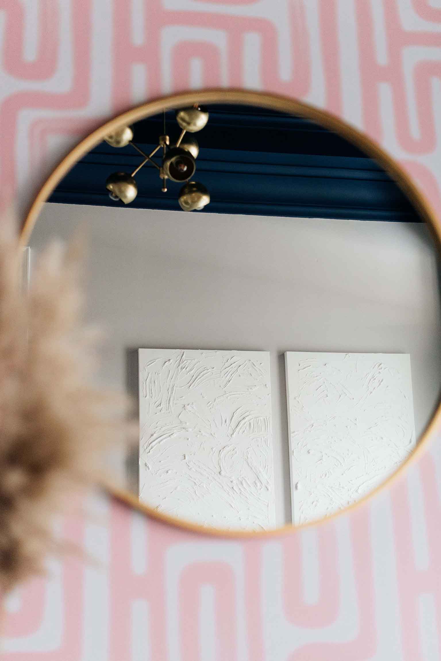
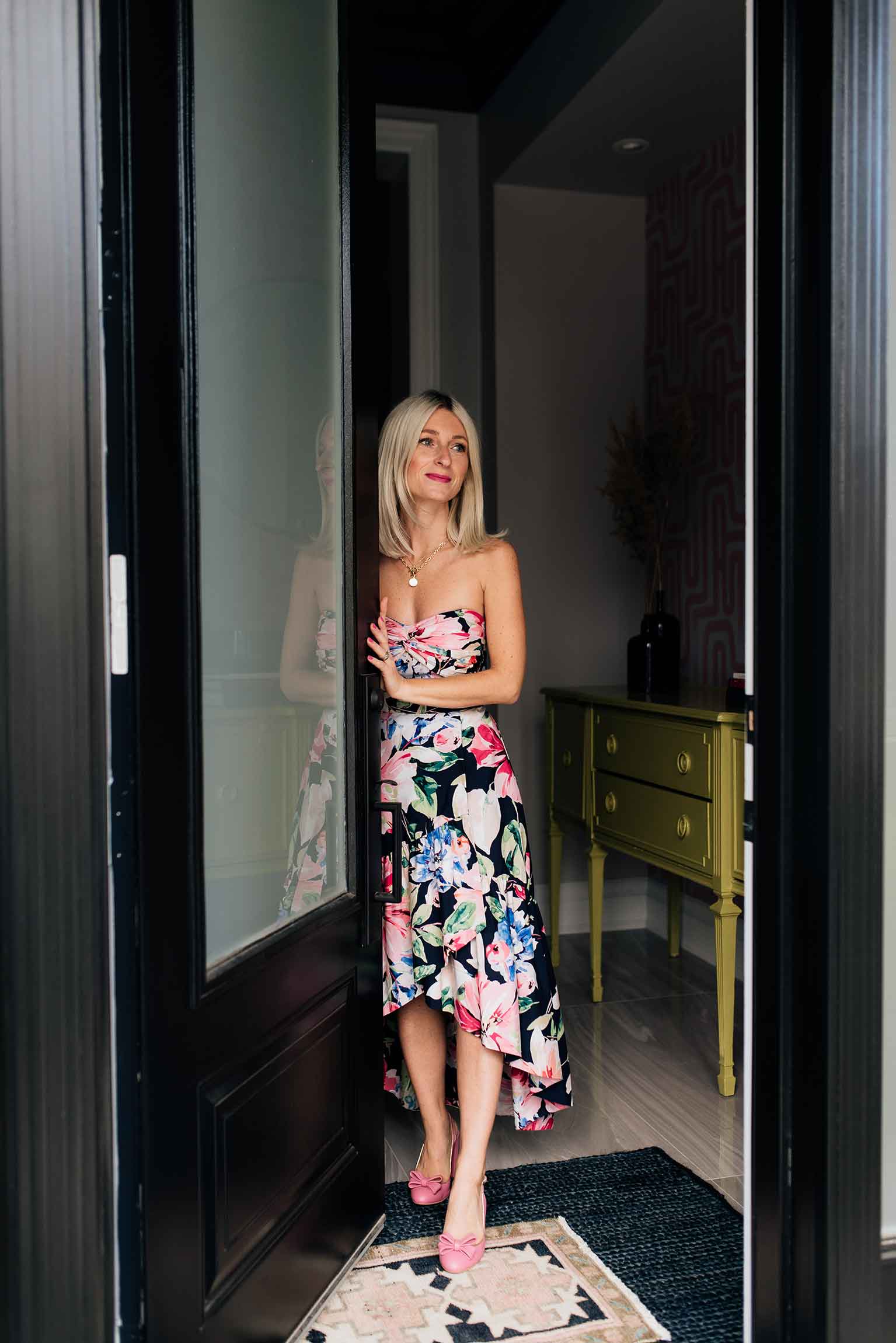
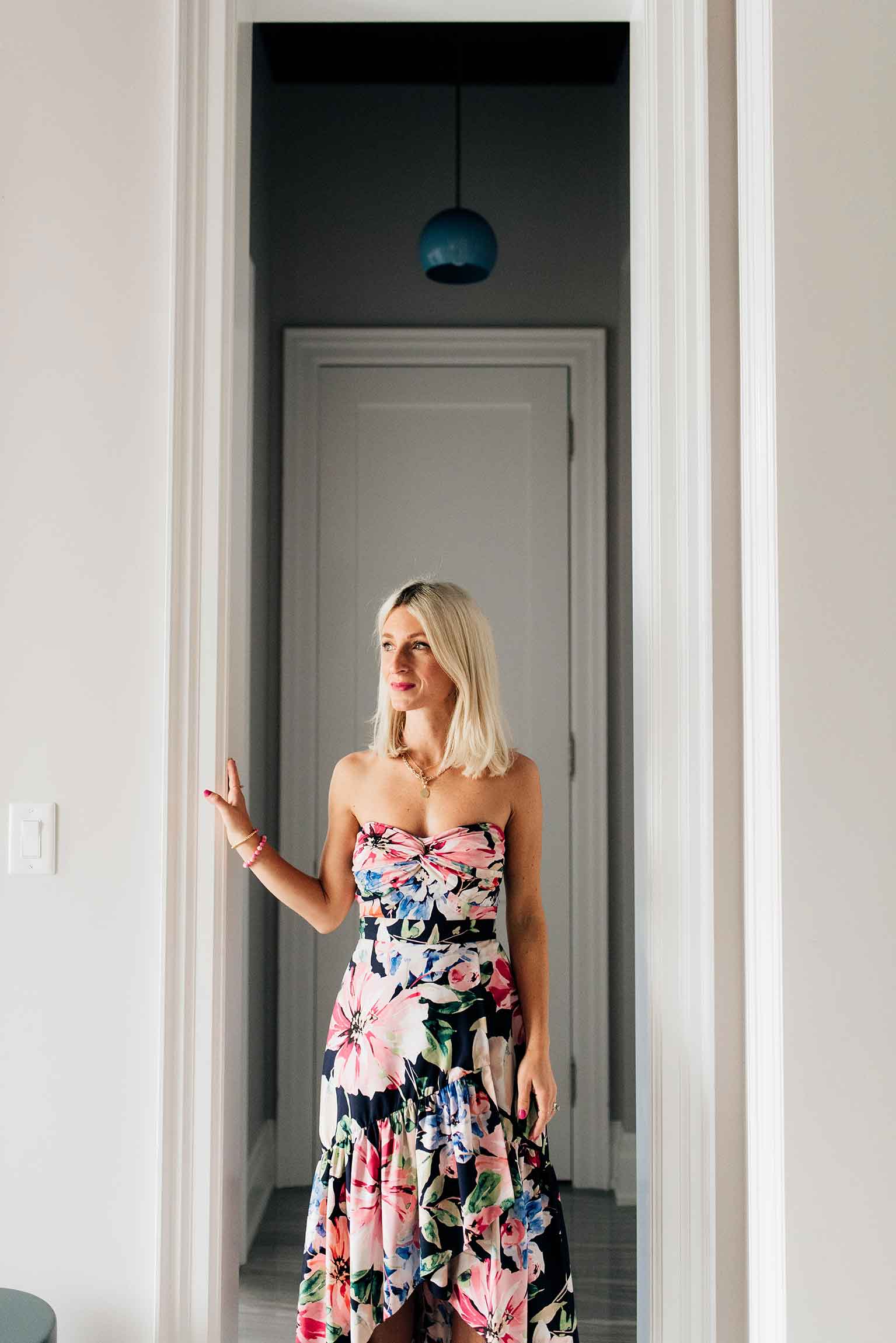
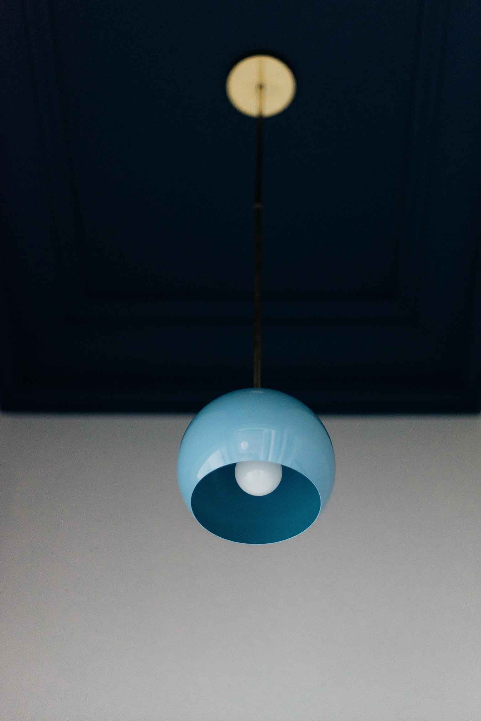
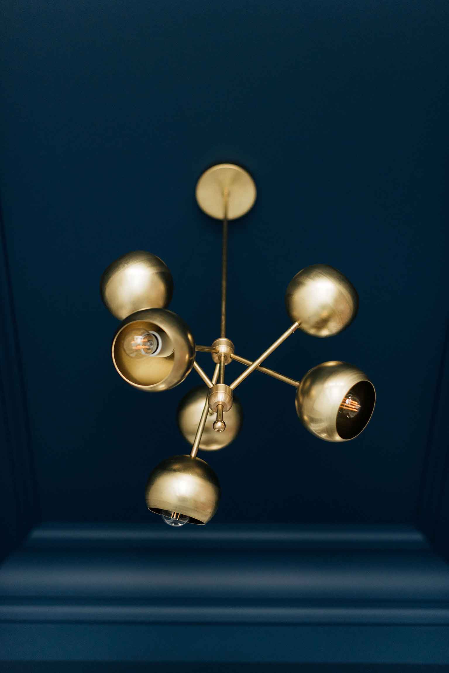 After finishing all the painting, wallpaper, replacing the glass in my front door (hello modern frosted glass), and having the exterior doors painted by the talented A+ Window Cleaning team, I decided to also change out the light fixtures to add to the fresh new feel of the space. I moved the existing chandelier to the powder room (my next project for the new year) because I still love it, and replaced it with the six-light Loa Marigny Chandelier from Sazerac Stitches. I love how the brass fixture looks right up against the navy ceiling and it adds such a warm, well-established look to the space – like it’s been there for years. I also added the Large Loa Pendant in Hydrangea Blue from Sazerac Stitches to the small hallway just off the entryway that leads to the powder room. I love how it adds a pop of colour to the ceiling and keeps the space fun and interesting.
Lighting is such an important part of any space, and I like to think of it as that last piece of jewelry you put on with an outfit to really complete the look. You guys know my love for Sazerac Stitches and these new light fixtures really are the finishing touch that perfectly ties this whole space together.
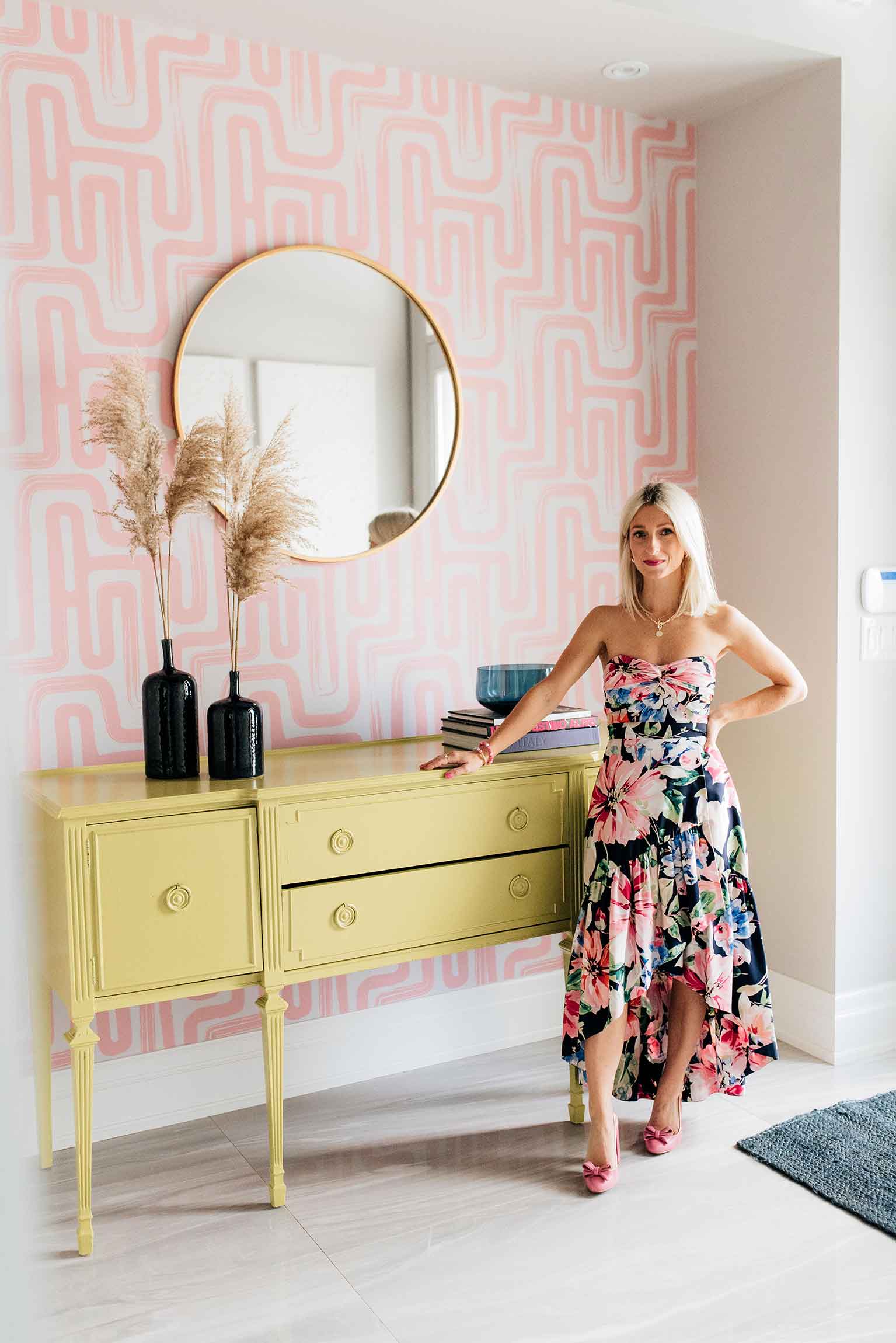
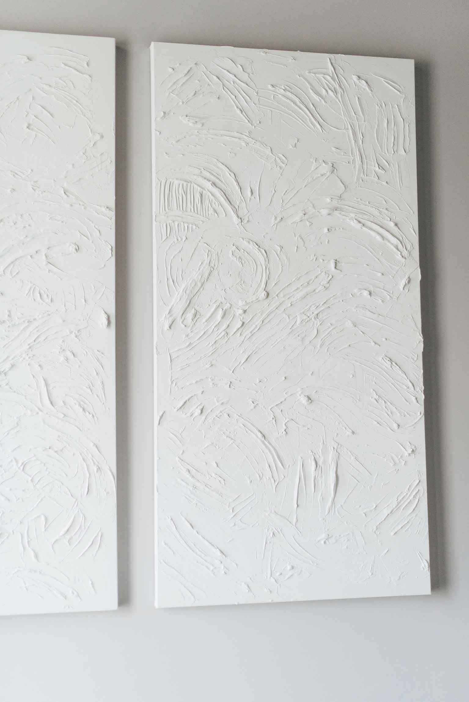
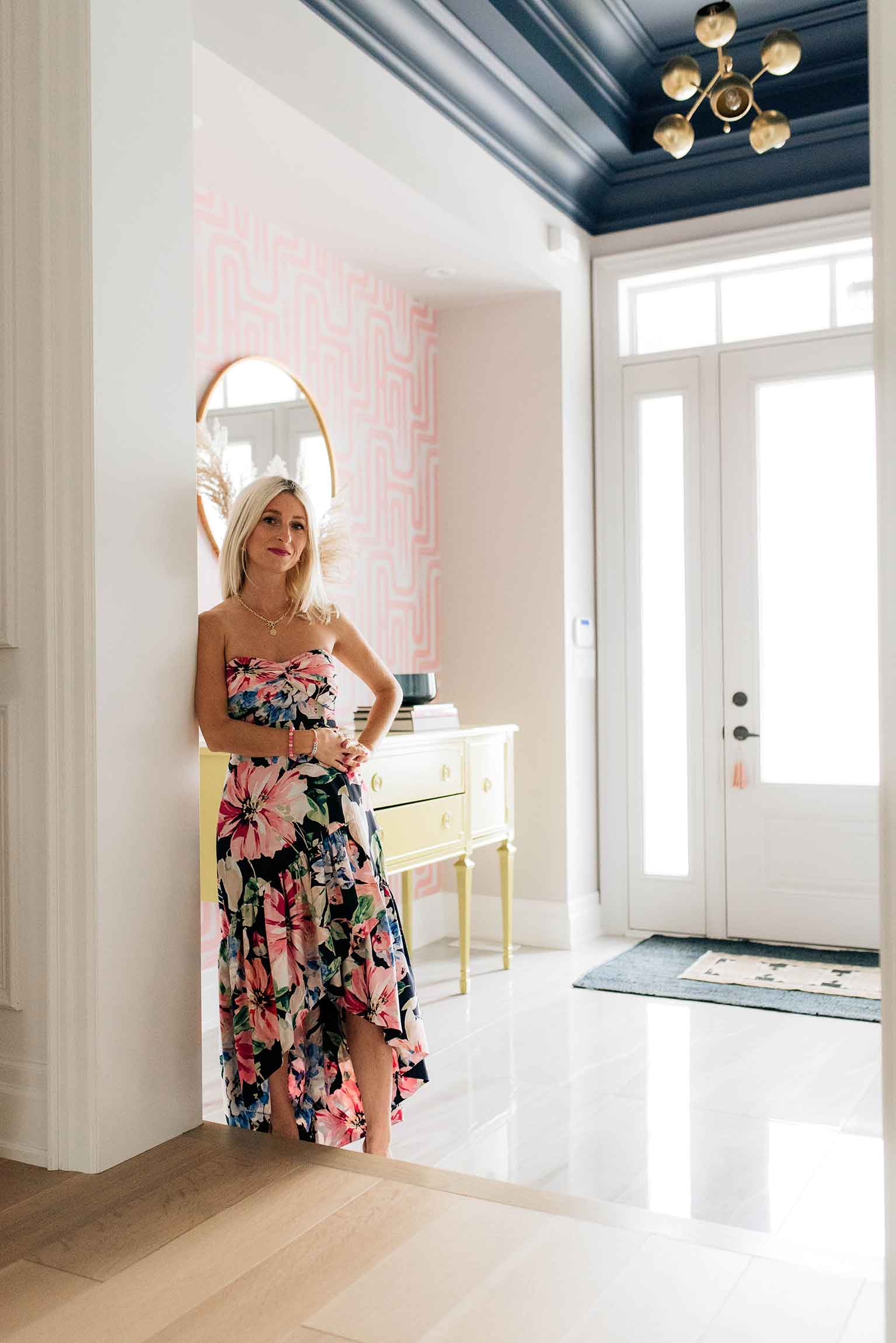
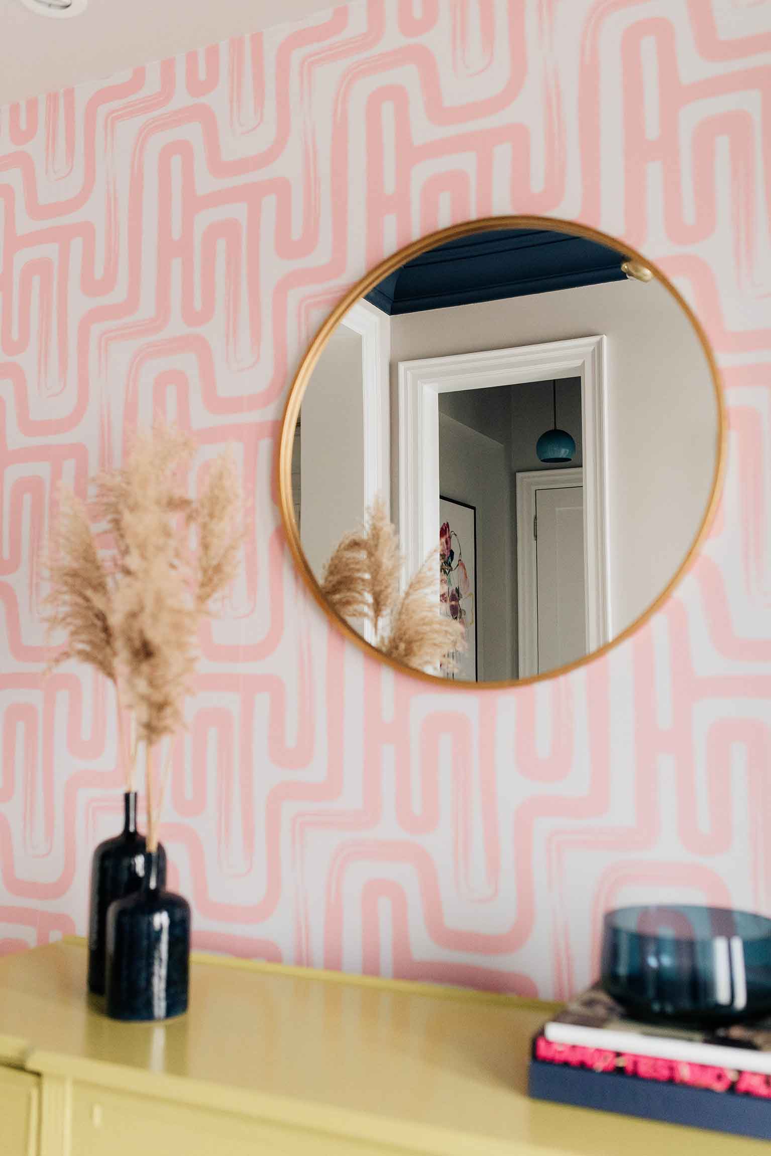
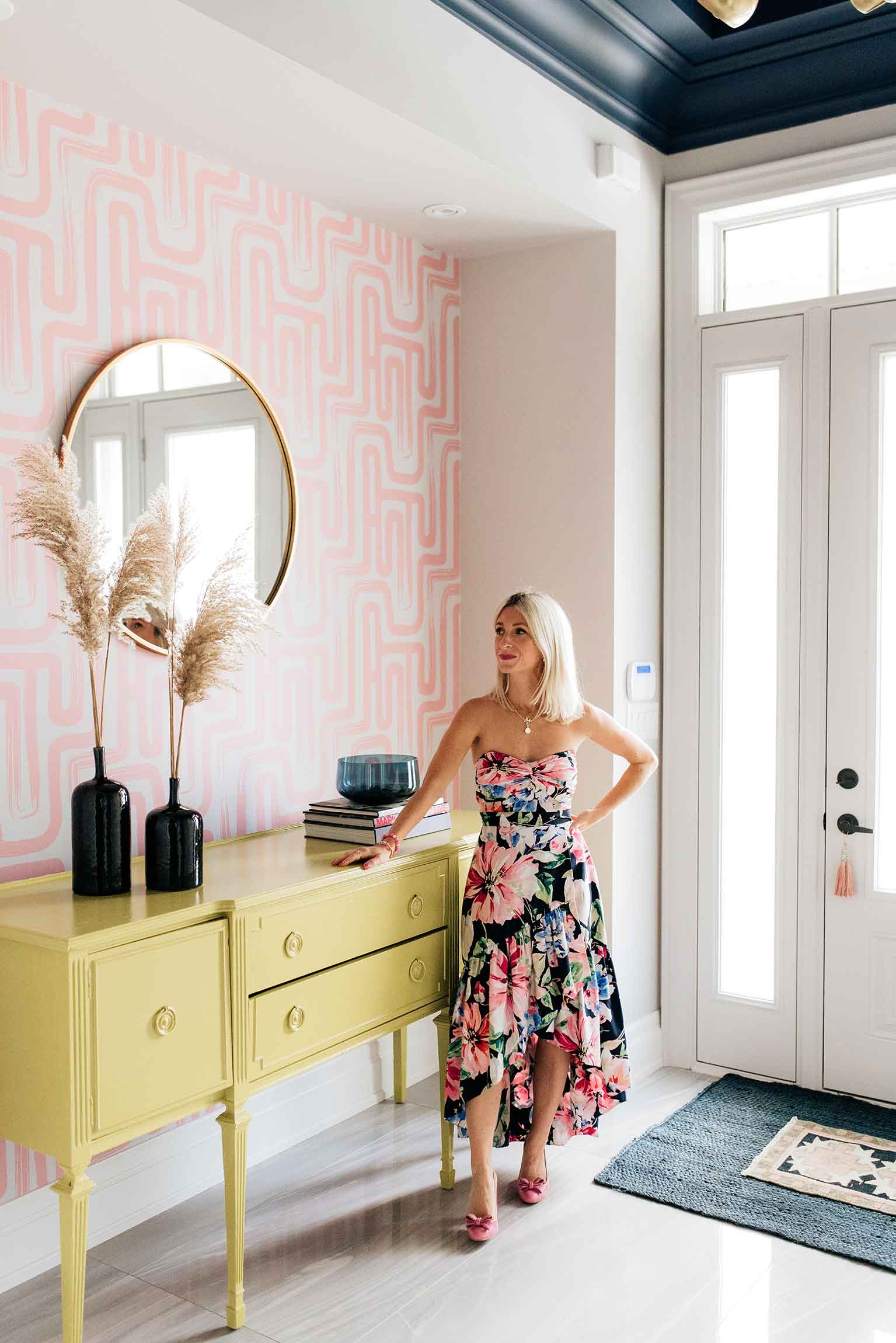
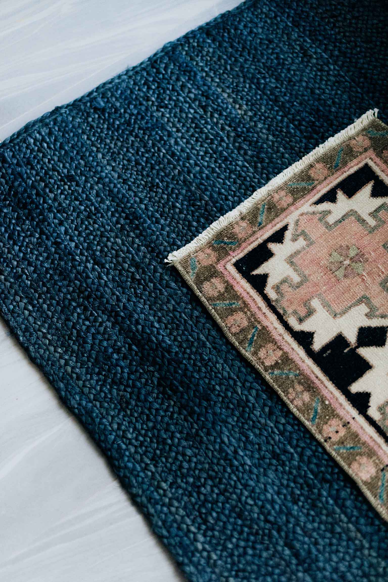
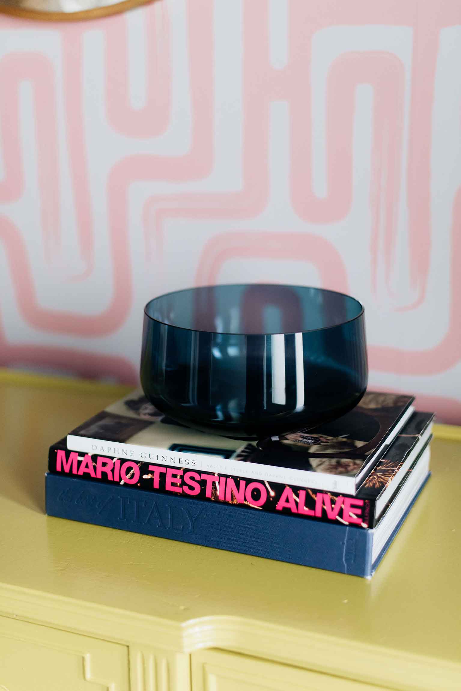
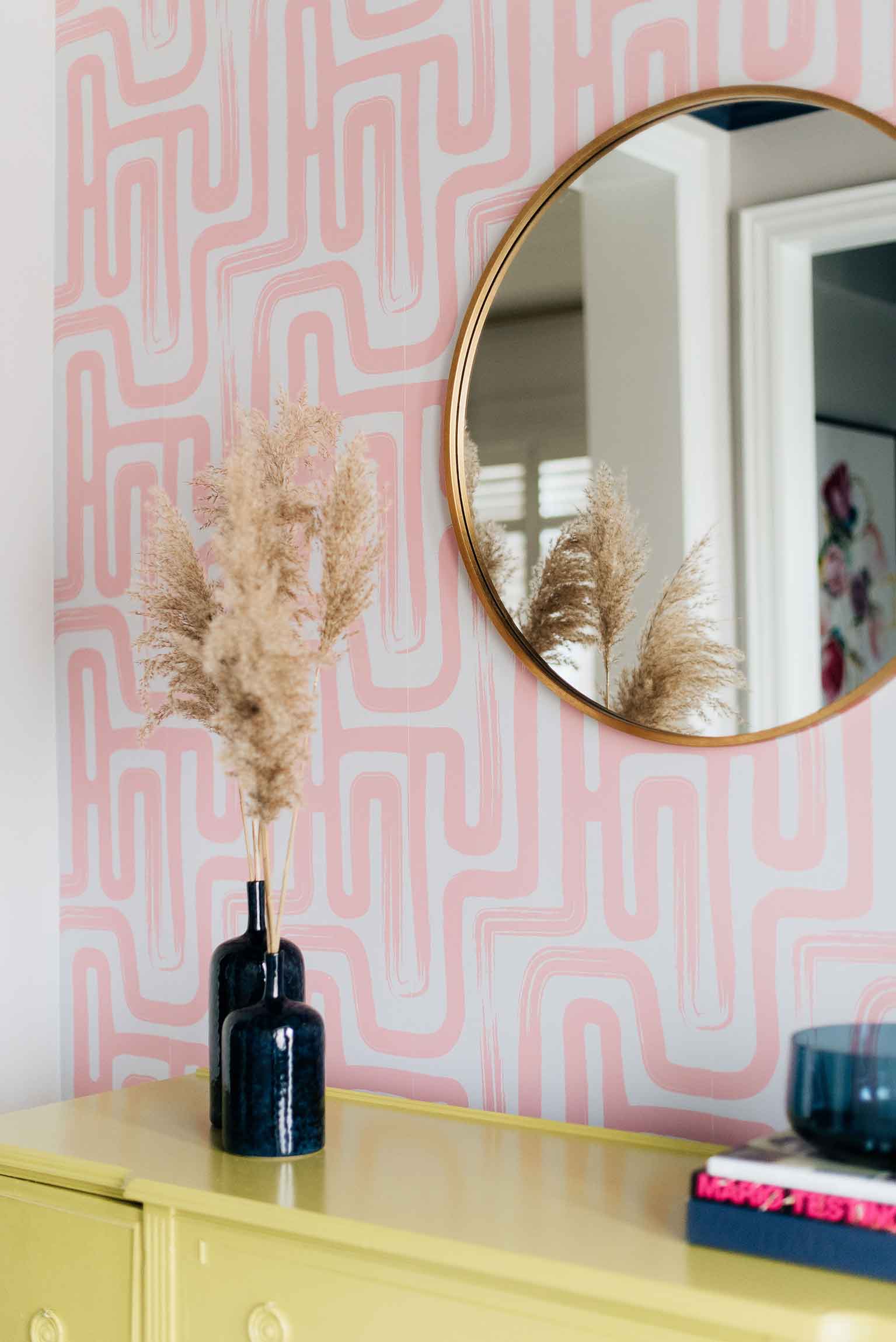
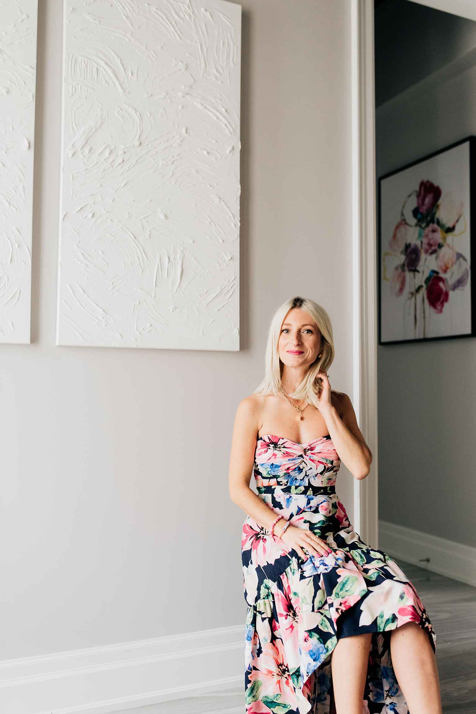
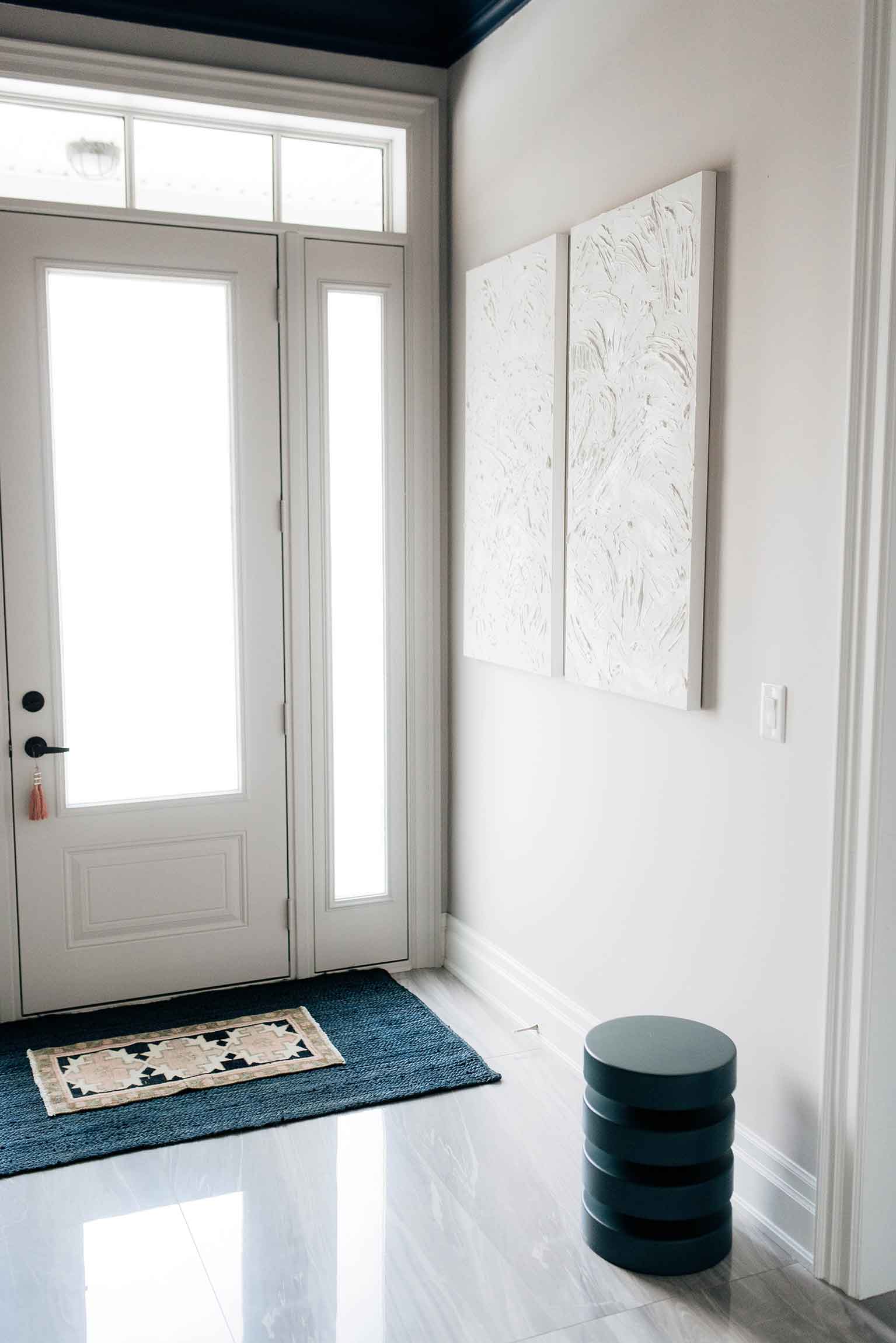
 A few other finishing touches that really helped take this space to the next level were the pair of textured original artwork by A Brush & Canvas, the mini vintage rug from Curated Content Co., and of course my paint makeover of this vintage buffet. I’ve had this (previously white) buffet for over 12 years and while I always loved the shape and look of it – my decor style has evolved over the years and I finally decided that it was a bit too french-country for my current taste. But instead of getting rid of it and investing in a new piece of furniture for this location, I decided to take a risk and paint it a bright, bold colour to really add some fun to the entryway – and am I ever glad I did. This glossy chartreuse buffet (Benjamin Moore 2024-10 Chartreuse) is now one of my favourite pieces in the house and hopefully it will last me another 12 years!
When all the major components of the space were complete and it was down to last minute decor touches – in an effort to not spend anymore money – I actually shopped my own house for the vases, books, pampas grass, and stool which in my opinion turned out better than buying everything new. I moved the pieces from my living room into the entryway, saved time and money, and the whole look came together just perfect!
Well, that was extremely long winded, but I hope you were able to take something away from this post to inspire YOUR next decor project, and I can’t wait to hear what it is!
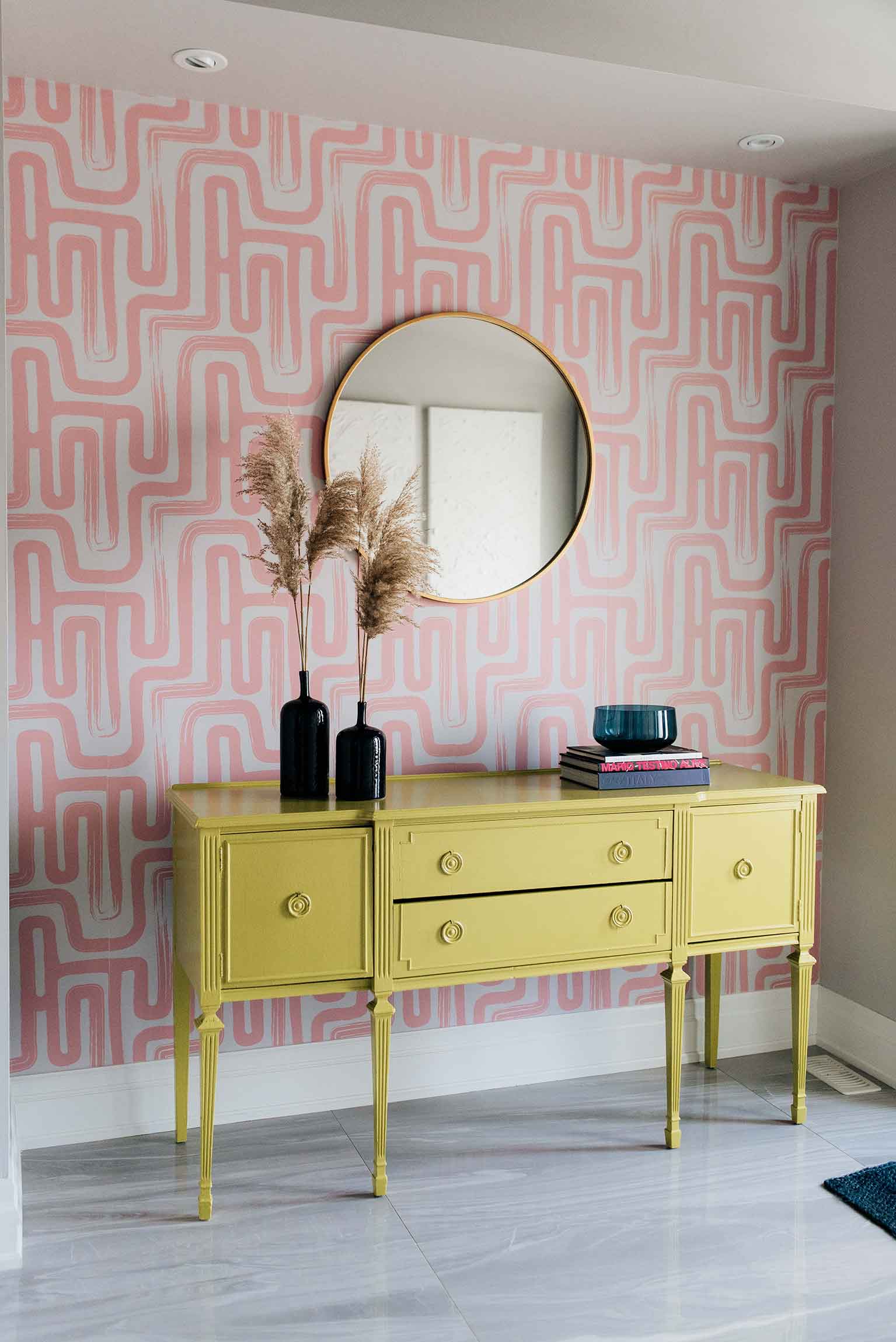
SOURCE LIST Wallpaper: c/o Livette’s Wallpaper | Lighting: c/o Sazerac Stitches | Cabinet: Vintage (Painted Benjamin Moore 2024-10 Chartreuse) | Pair of White Canvas Art: A Brush & Canvas | Door Painting: A+ Window Cleaning | Flooring: Sarana Tile | Navy Rug: Amazon.ca | Mini Vintage Rug: Curated Content Co. | Mirror: Similar | Pampas Grass: Bloom Scout | Vases: Similar | Bowl: Similar | Books: Value Village | Floral Artwork: HCD Furniture | Stool: West Elm | Dress: Eliza J (old) | Necklaces: c/o Melanie Auld
*Photos by: Darby Mitchell Photography
