May 24th, 2021
FRESH & FLORAL GUEST BEDROOM REVEAL
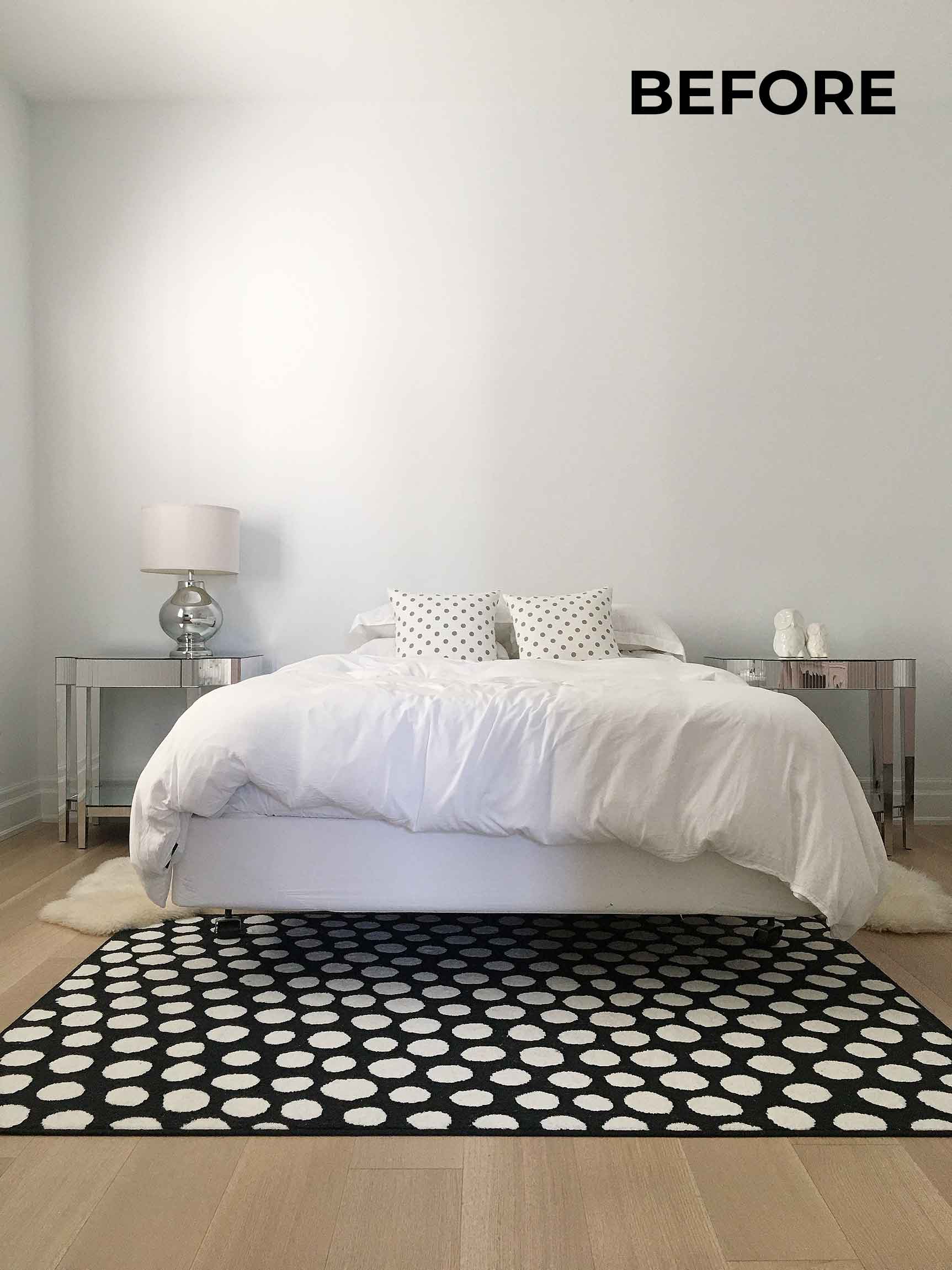
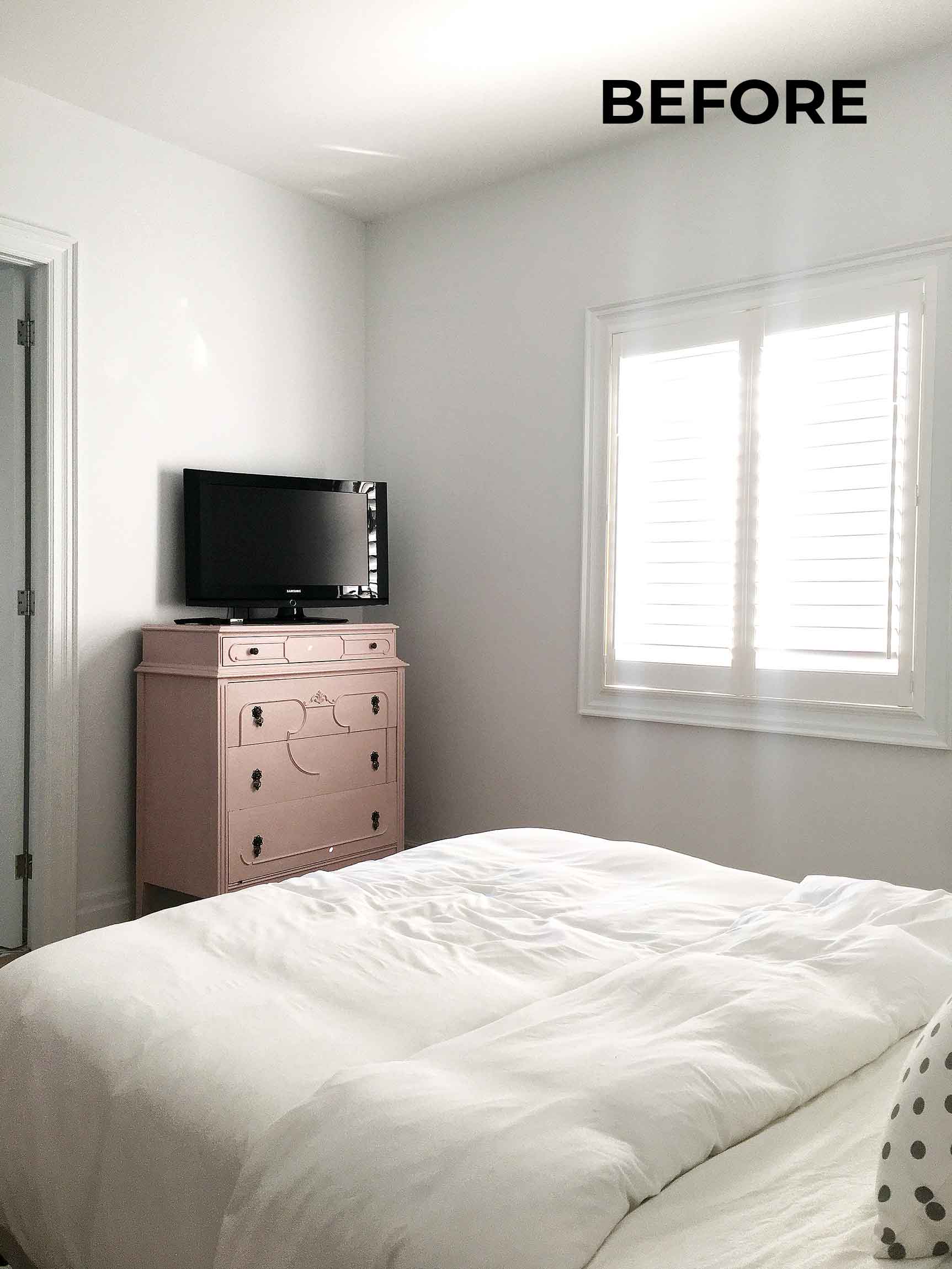
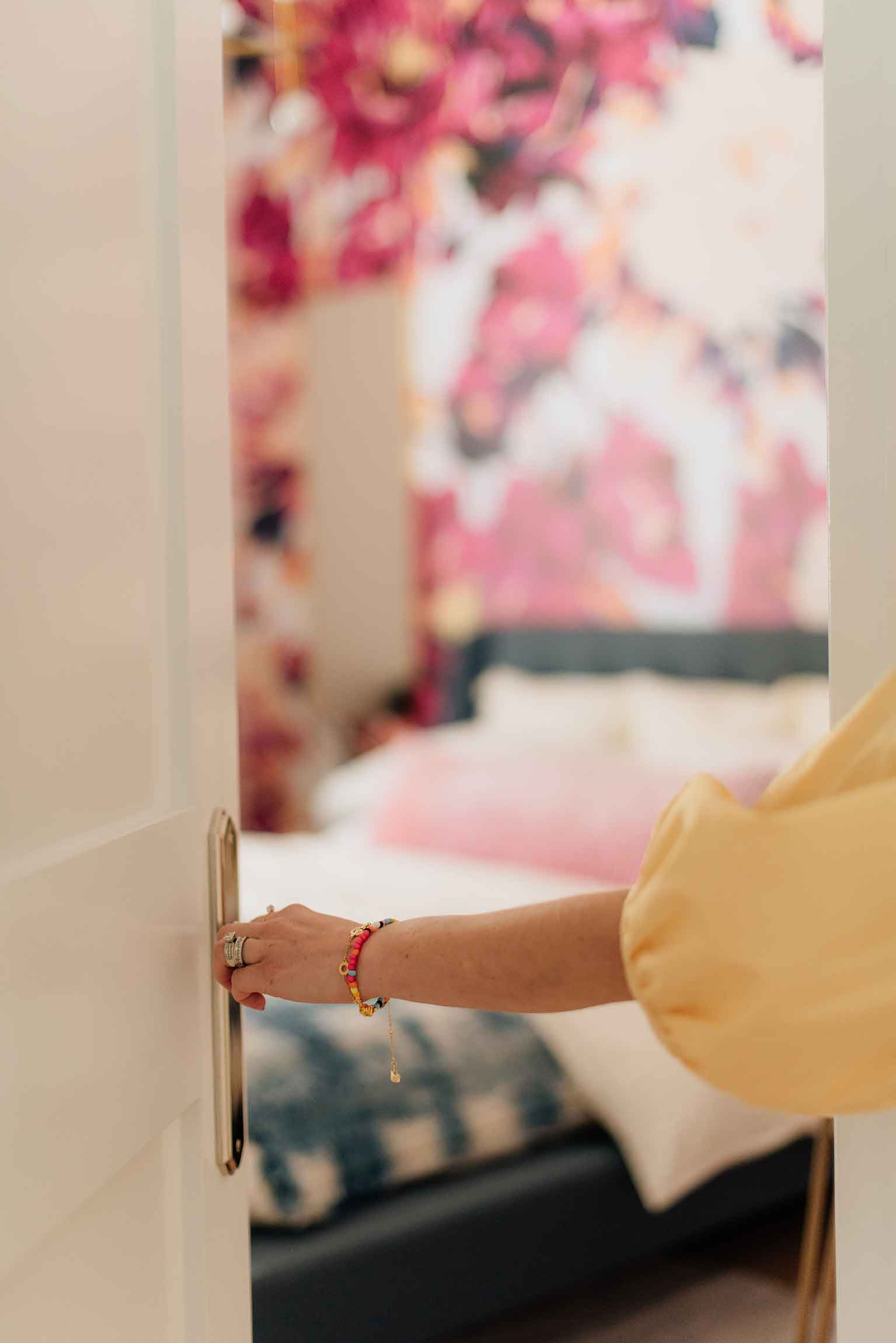
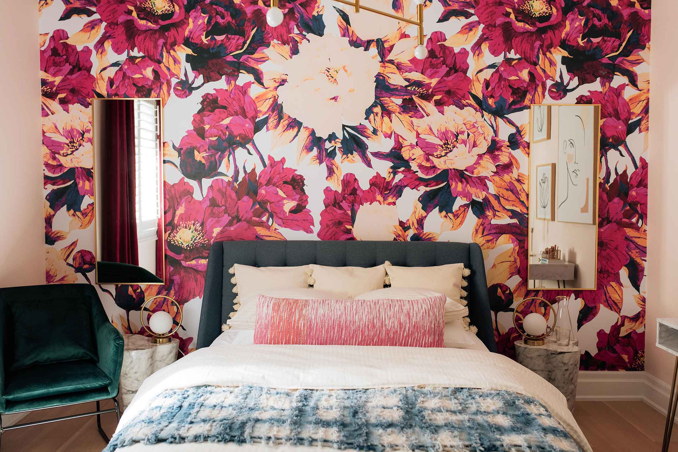
I am so excited to finally share with you guys our Guest Bedroom reveal! This space was such a labour of love and I cannot wait to share it with our family and friends when it’s finally safe to have them back to our home for a visit.
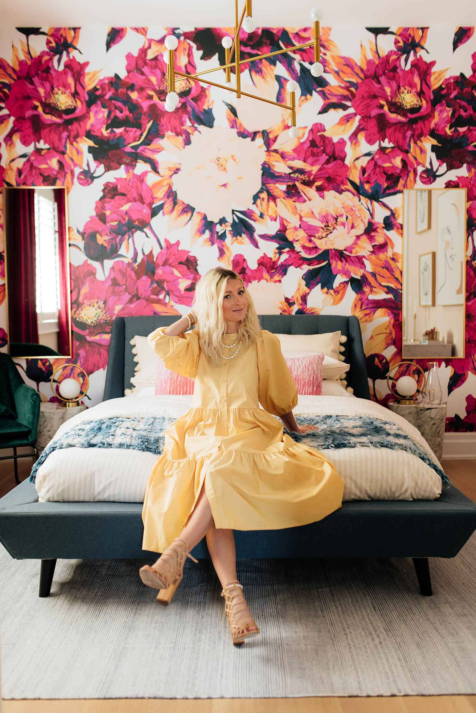
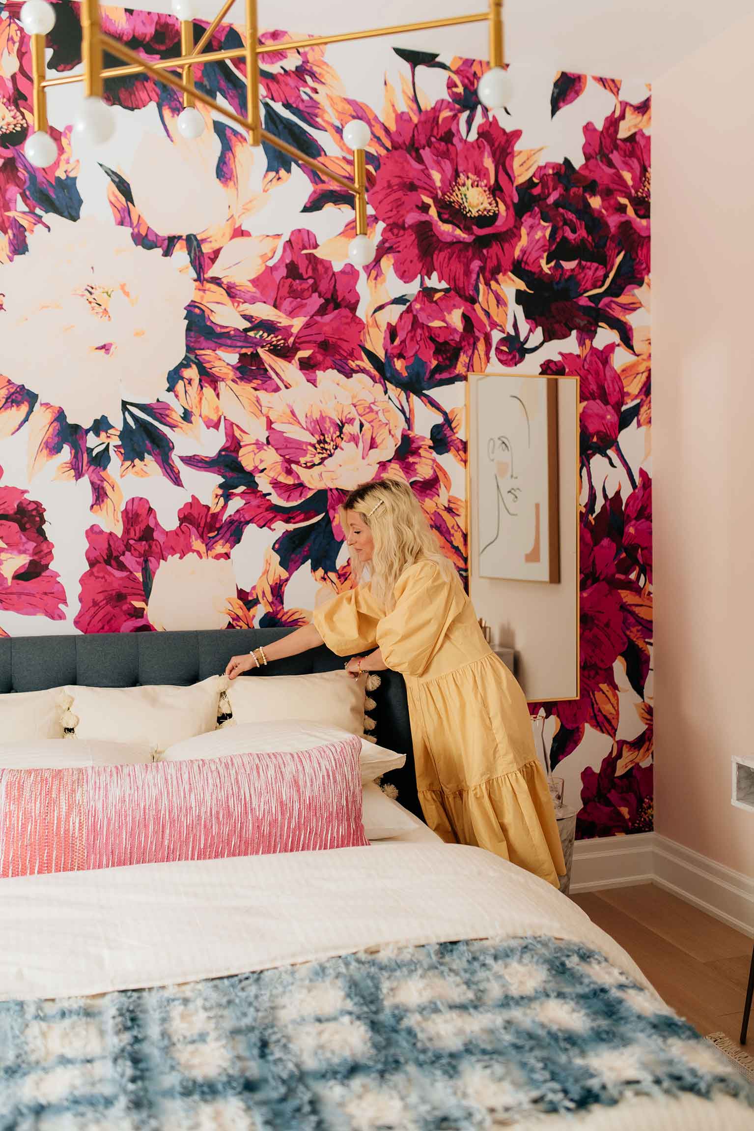
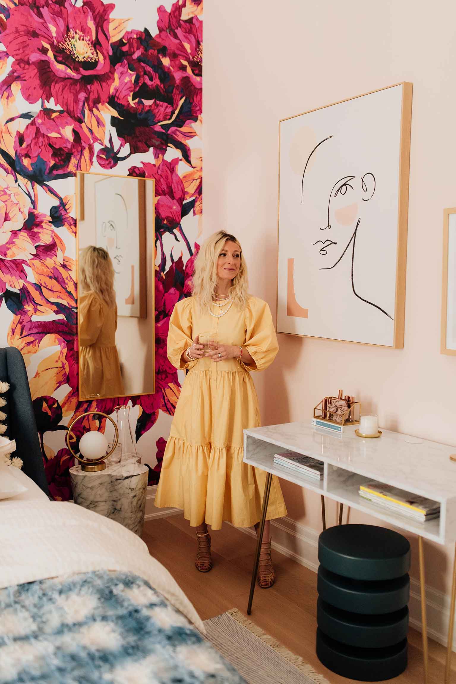
As you probably know, my decor goal is to infuse as much colour as possible into each room in our home – each in its own unique way – and I’m happy to report that this bedroom has become the most colourful yet! Being careful to avoid the design becoming overly feminine, I balanced out the gorgeous rich fuchsia with deep navy tones and plenty of gold accents so that anyone can feel comfortable in this home away from home.
A few months back on the blog you may have seen how we transformed the plain white walls of this room into what they are today with a little help from Digby Paints. I’m still so in love with the colours we chose and they really set the mood for the rest of the room’s design.
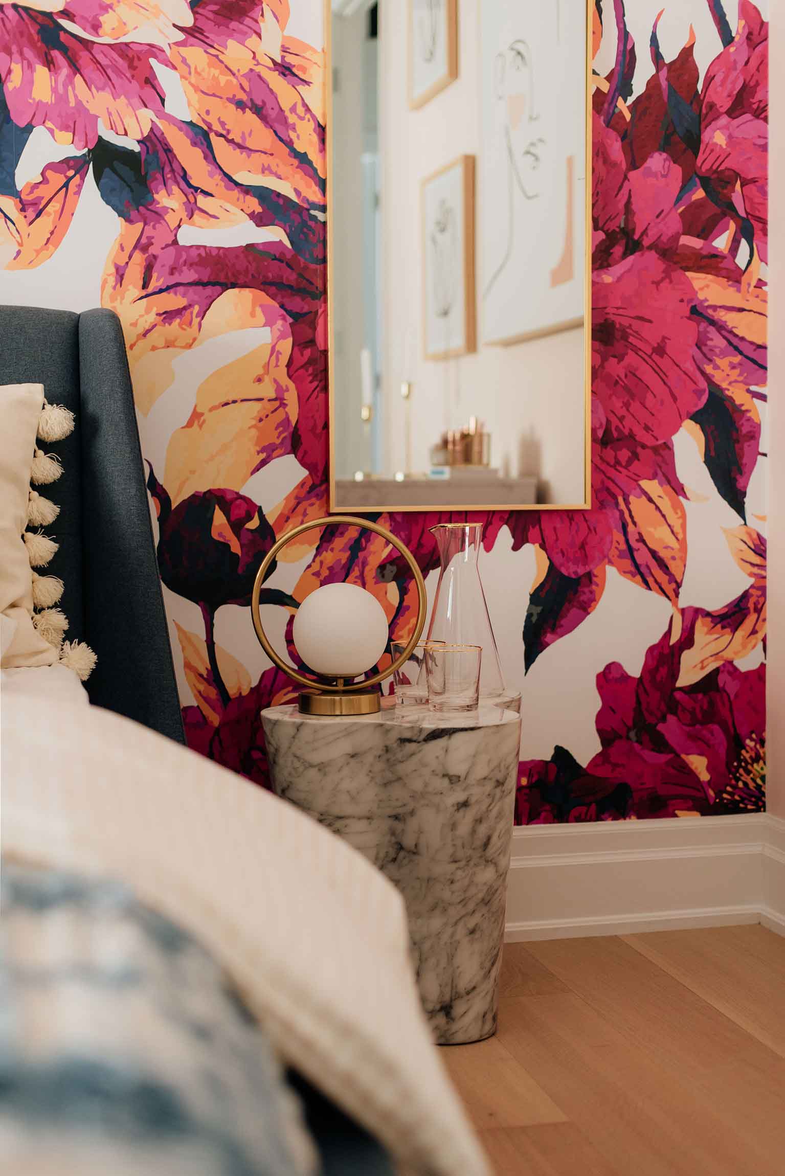
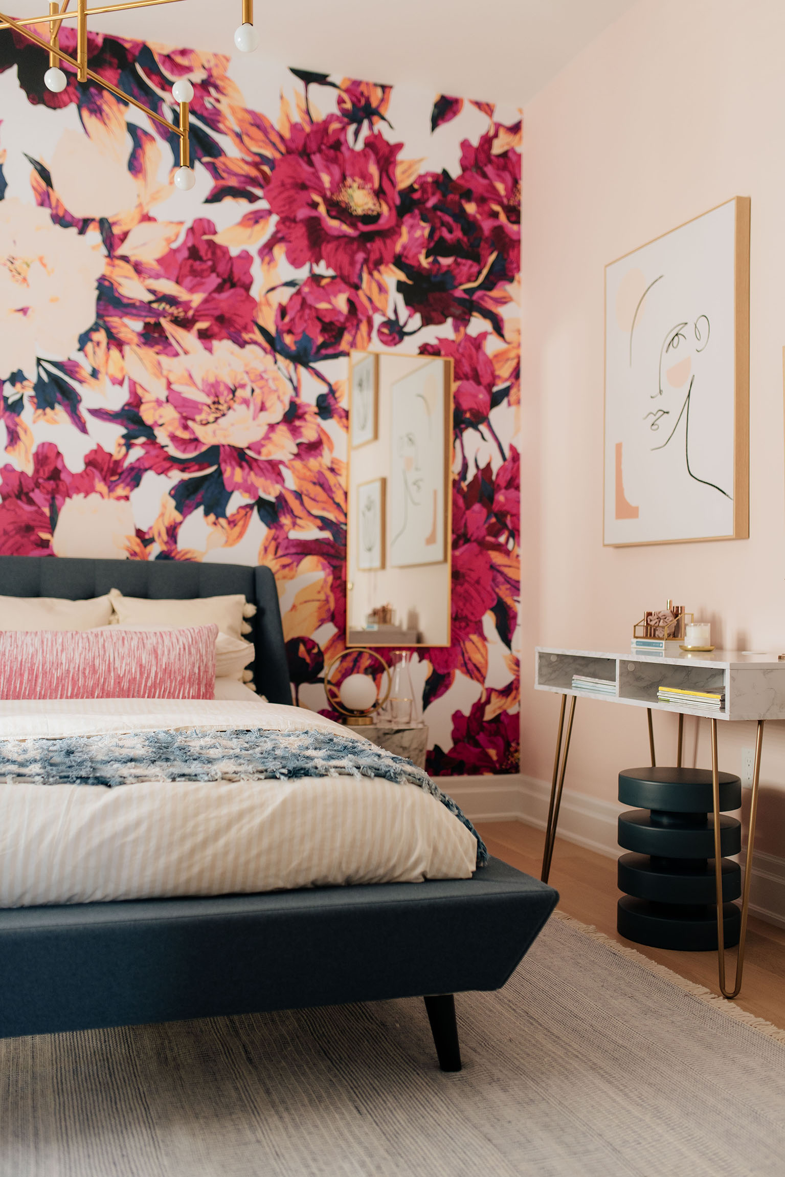
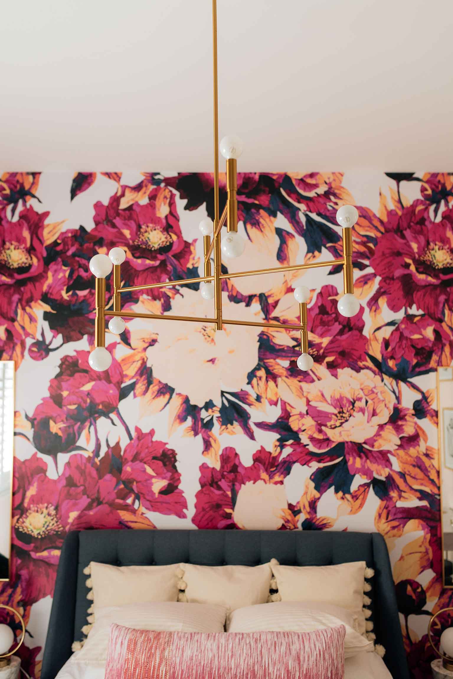
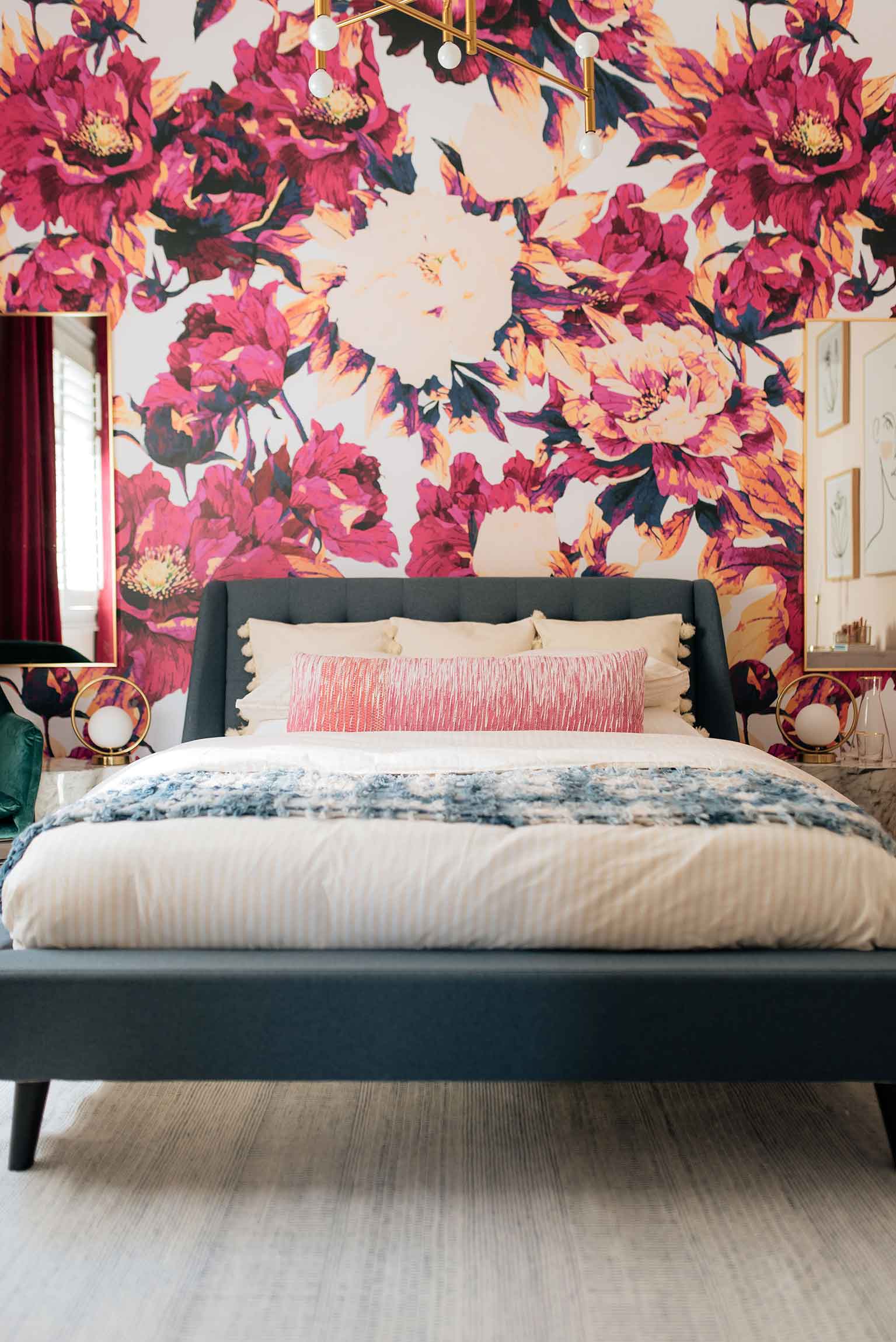
We left one accent wall for a super-fun wallpaper project, and I could not be happier with how this Livettes paper install turned out. As you may remember we used paper from Livettes in our entryway a few months ago, and the quality of the product and their fresh, modern designs are what had me come back to them once again for this project. We chose the Bold Floral Removable Wall Mural and after having now installed 5 wallpaper projects in this home – this was the best (and easiest) one yet! The colours on this mural are out of this world and I fall more and more in love with it every time I walk into the room!
Removable wallpaper sounds easier to install than it actually is (that first panel is the trickiest), but this time around I tried a new method which couldn’t have been more simple. Since I always put up paper on my own, I discovered that taping each panel in place with painters tape and slowly removing the tape as I work my way down each panel significantly reduced the paper shifting as it gets applied to the wall. I highly recommend trying this method the next time you install removable paper.
Once the walls were complete it was time to bring in the furniture! When we first moved into our home two years ago the guest room was a mishmash of leftover pieces from previous homes – so it was definitely time for an upgrade – and that upgrade came from our friends over at Canadian modern furniture brand Mobilia. We turned to Mobilia to help us select the perfect pieces for our space that would provide both function and fashion-forward design. Their high-quality pieces were what initially attracted me to the brand and I couldn’t be happier with how the pieces we selected look in our space.
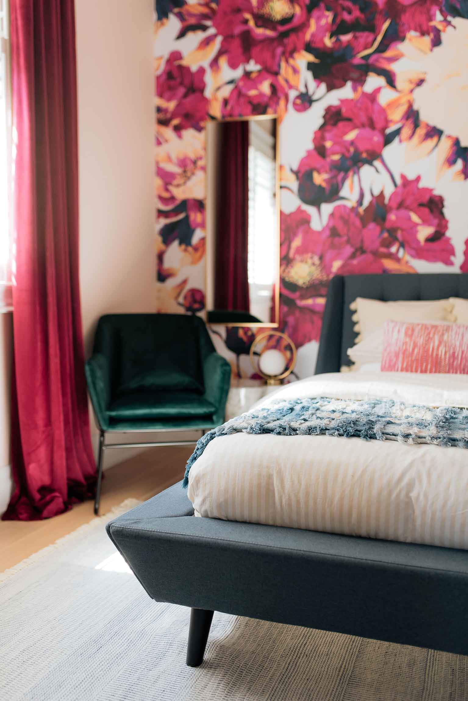
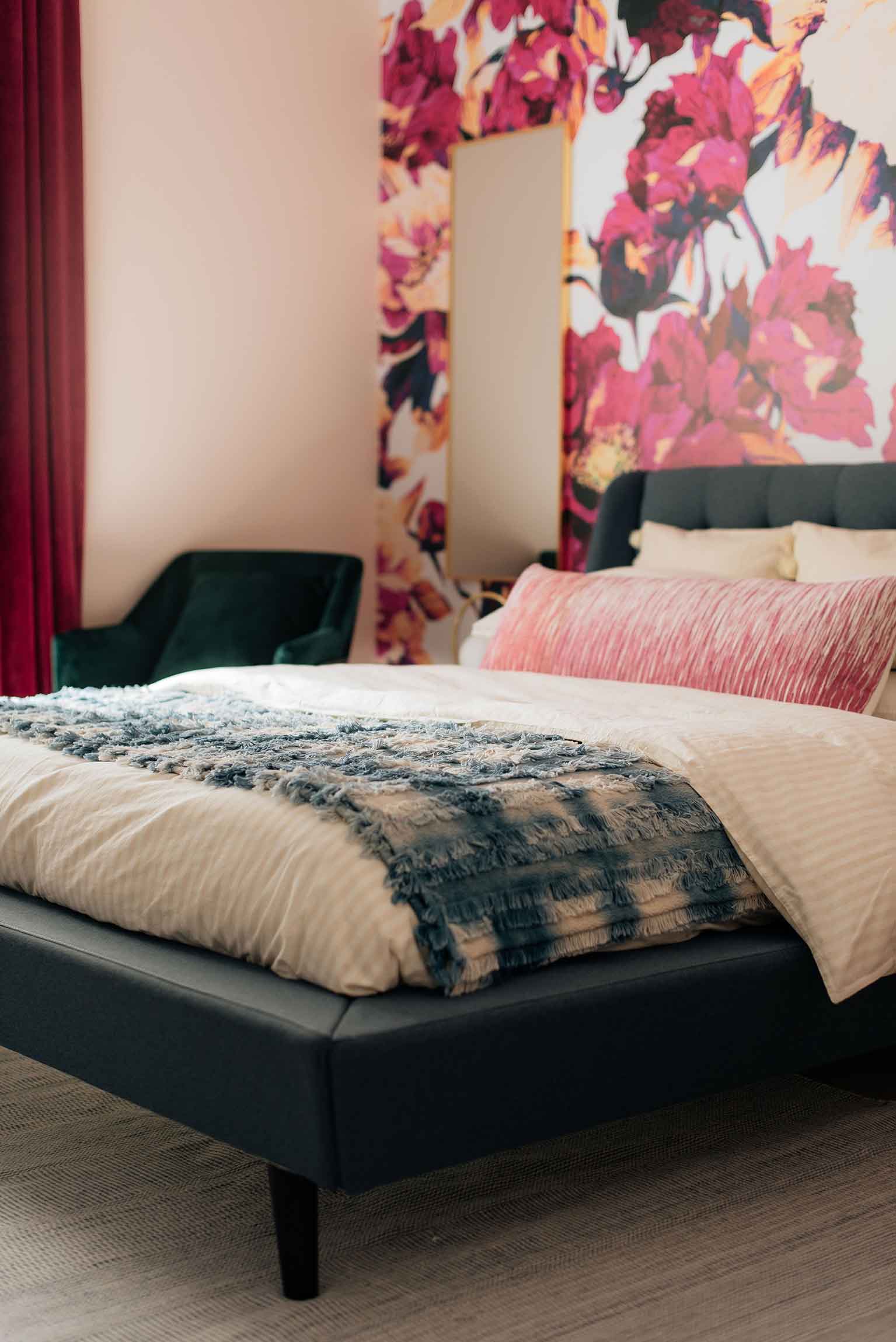
We chose the SAREEN fabric bed in dark blue, and I love how the colour coordinates so well with the fuscia-infused wallpaper behind it. The retro vibes couldn’t be any more perfect, and the quality is impeccable. This may be the “guest” bedroom, but since this bed arrived we’ve all been taking turns sleeping in it and we may have a hard time turning it over to guests when the time comes :)
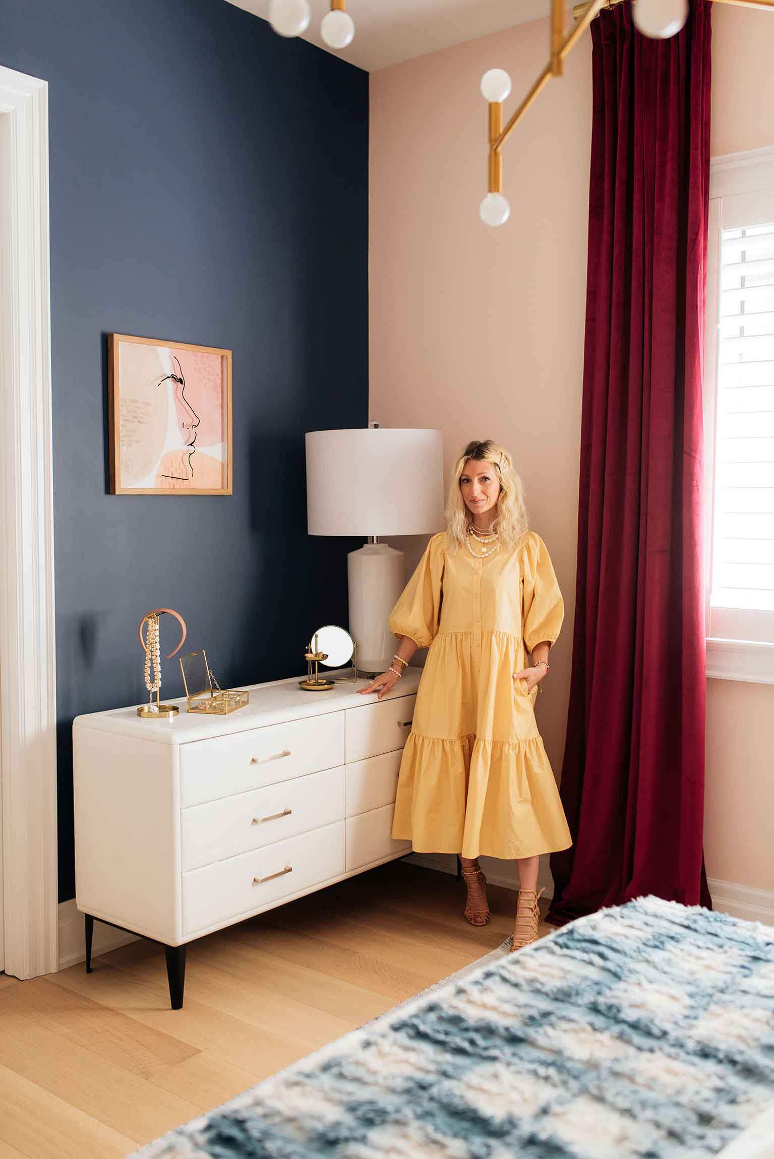
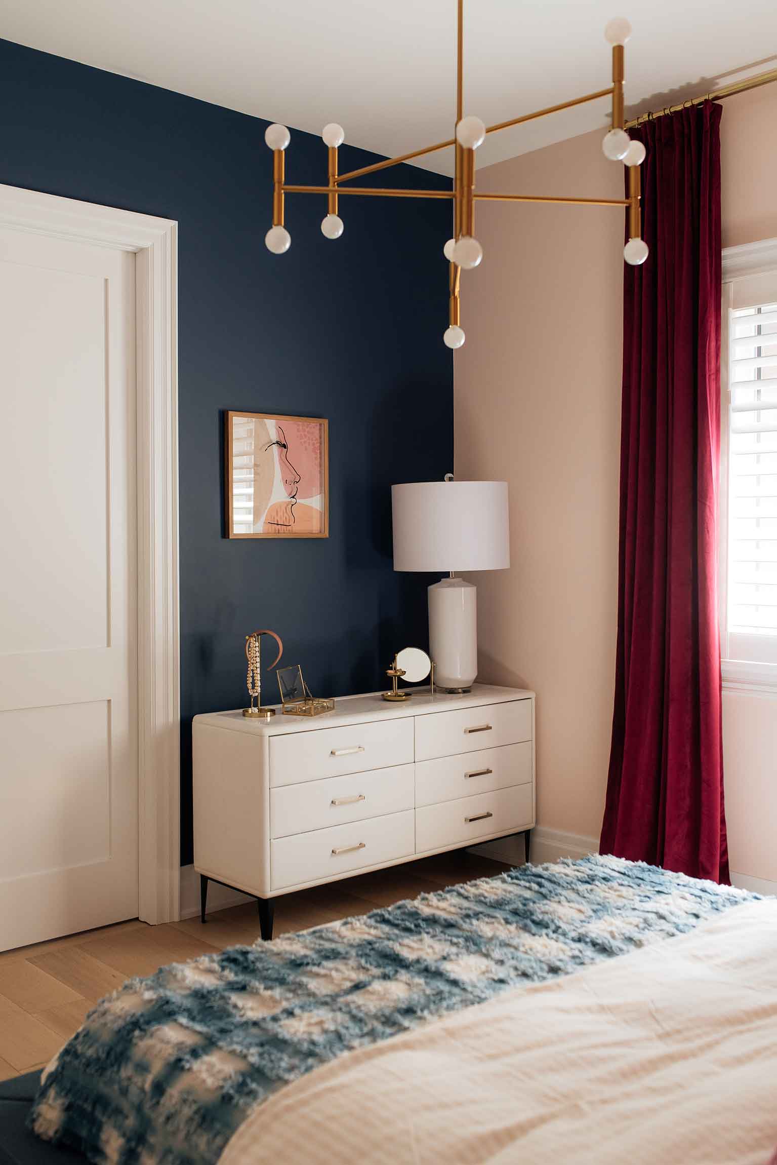
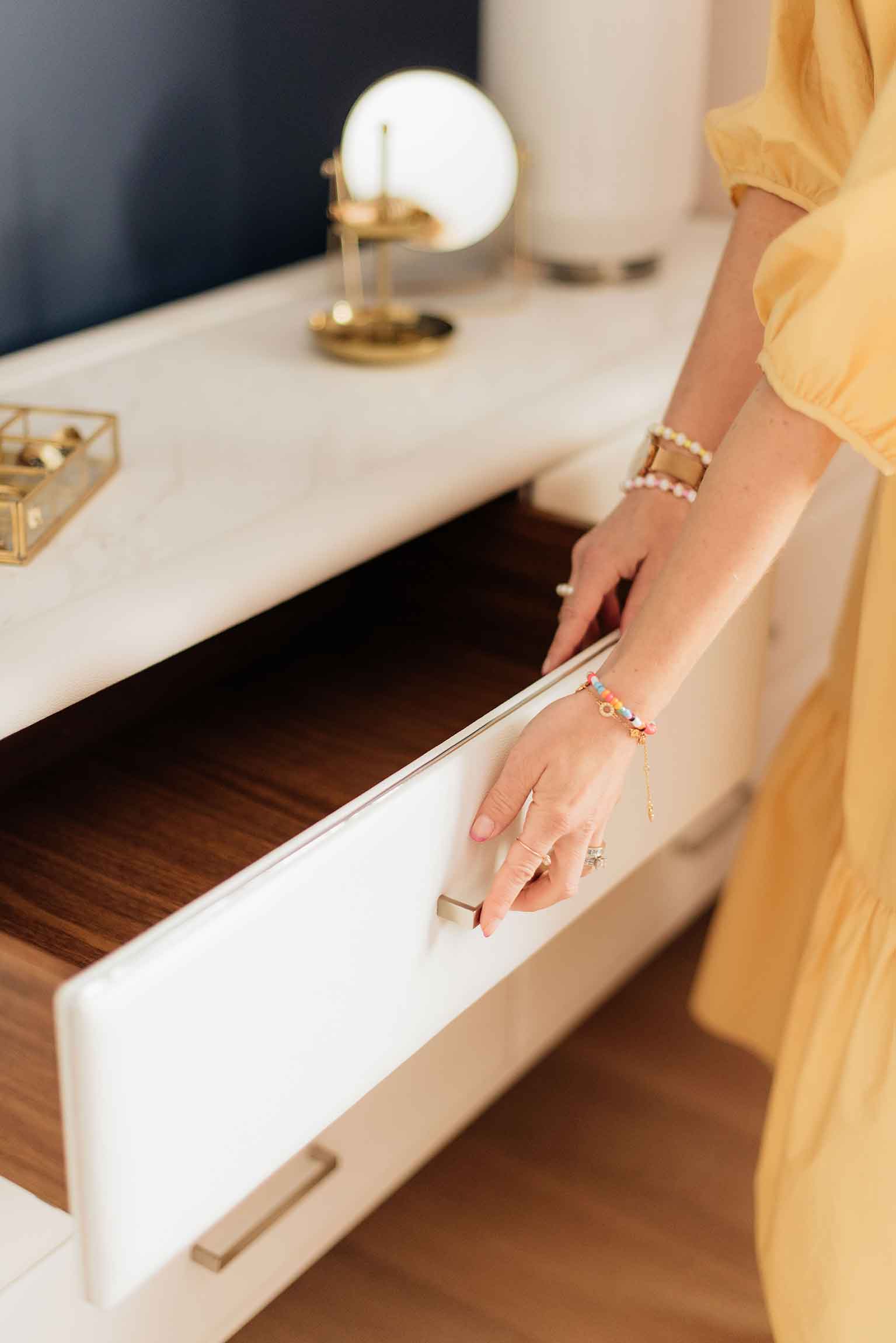
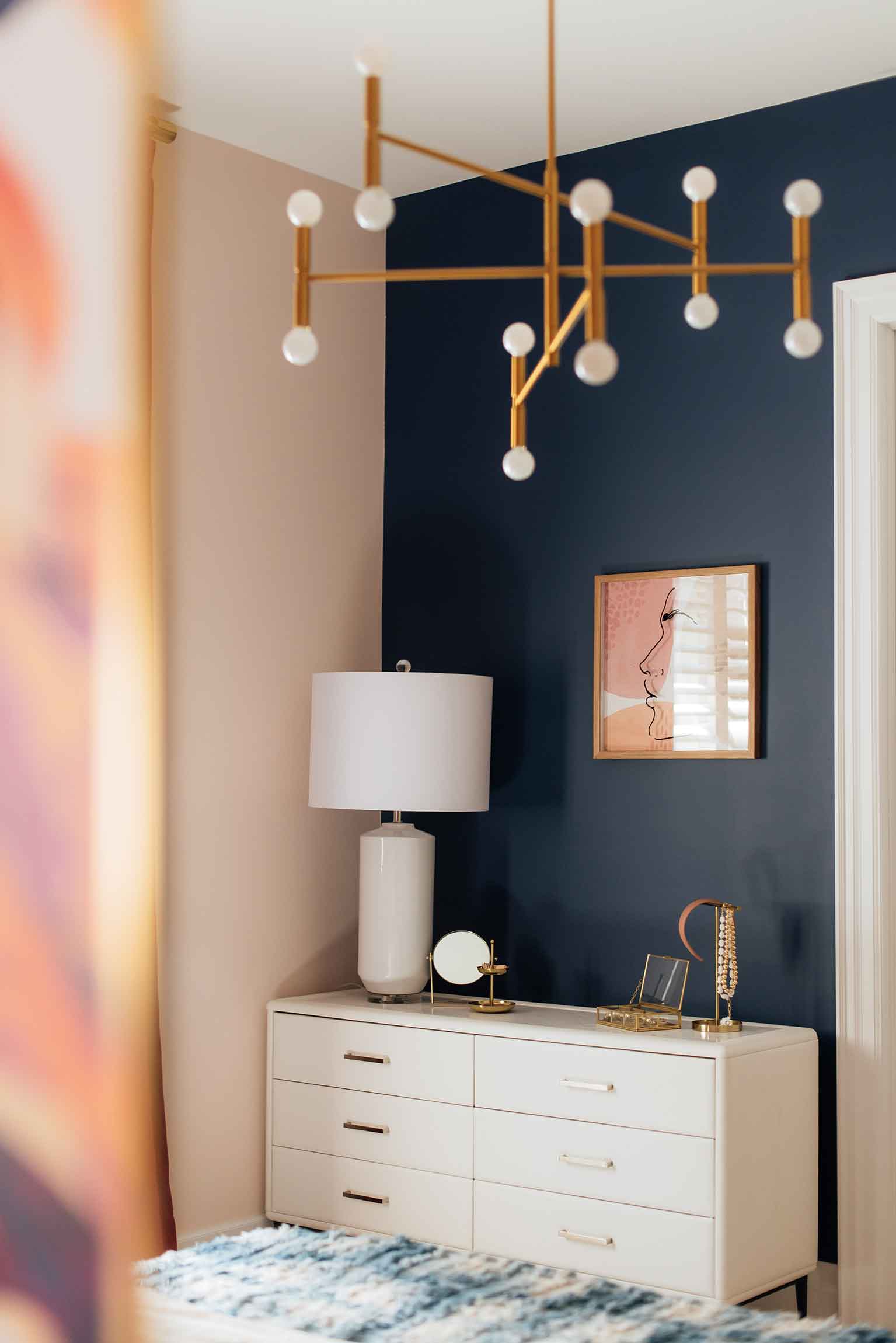
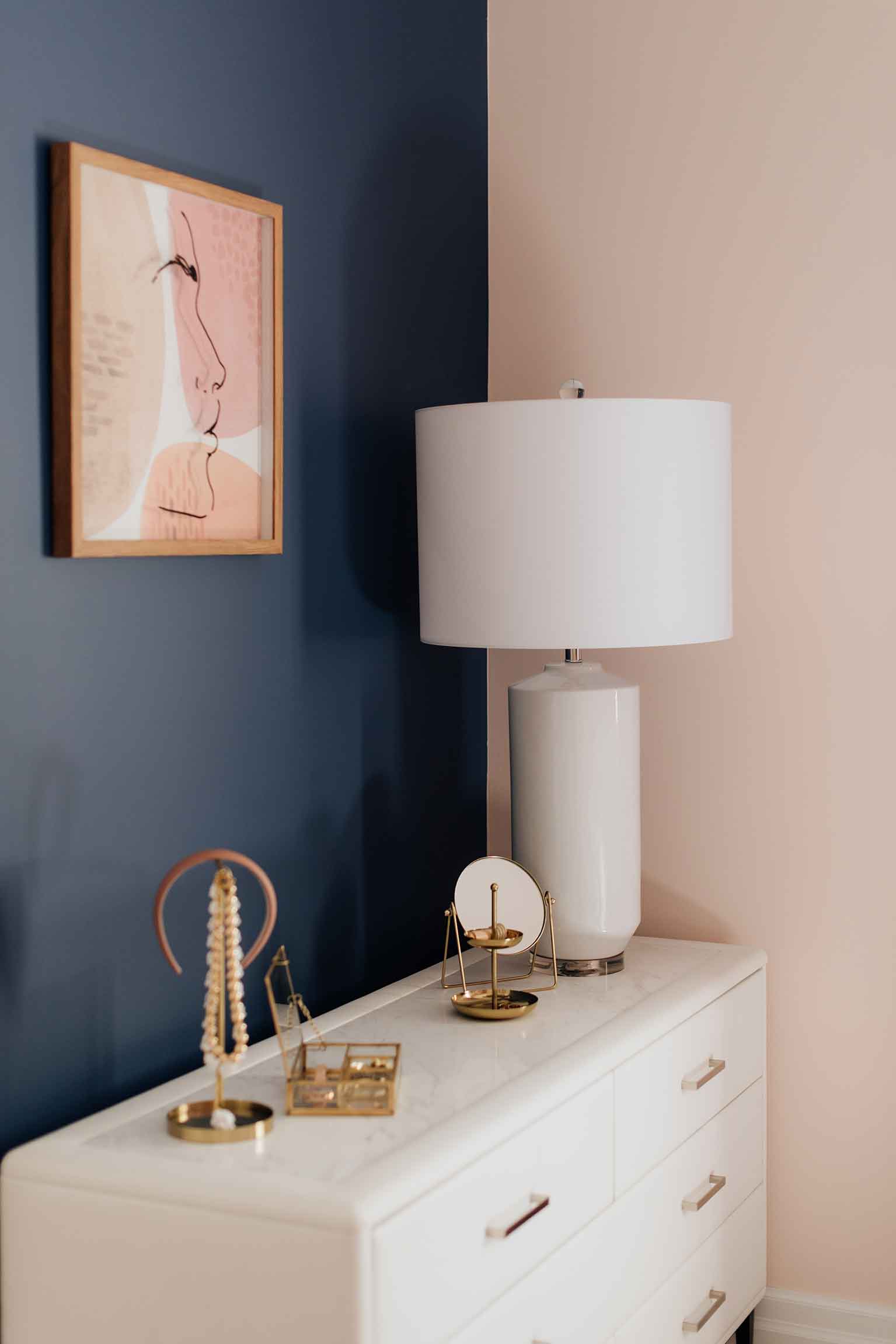
For the dresser we went with the WEBORA style because of the white faux-leather upholstery that really pops against the navy wall. This low-profile design fits perfectly on the wall across from the bed and we added a little height with an oversized table lamp to really draw the eye up. The genuine marble top is the perfect surface for tabletop decor, and we used it to carry a bit of a marble accent theme through the room right to the side tables and even the desk.
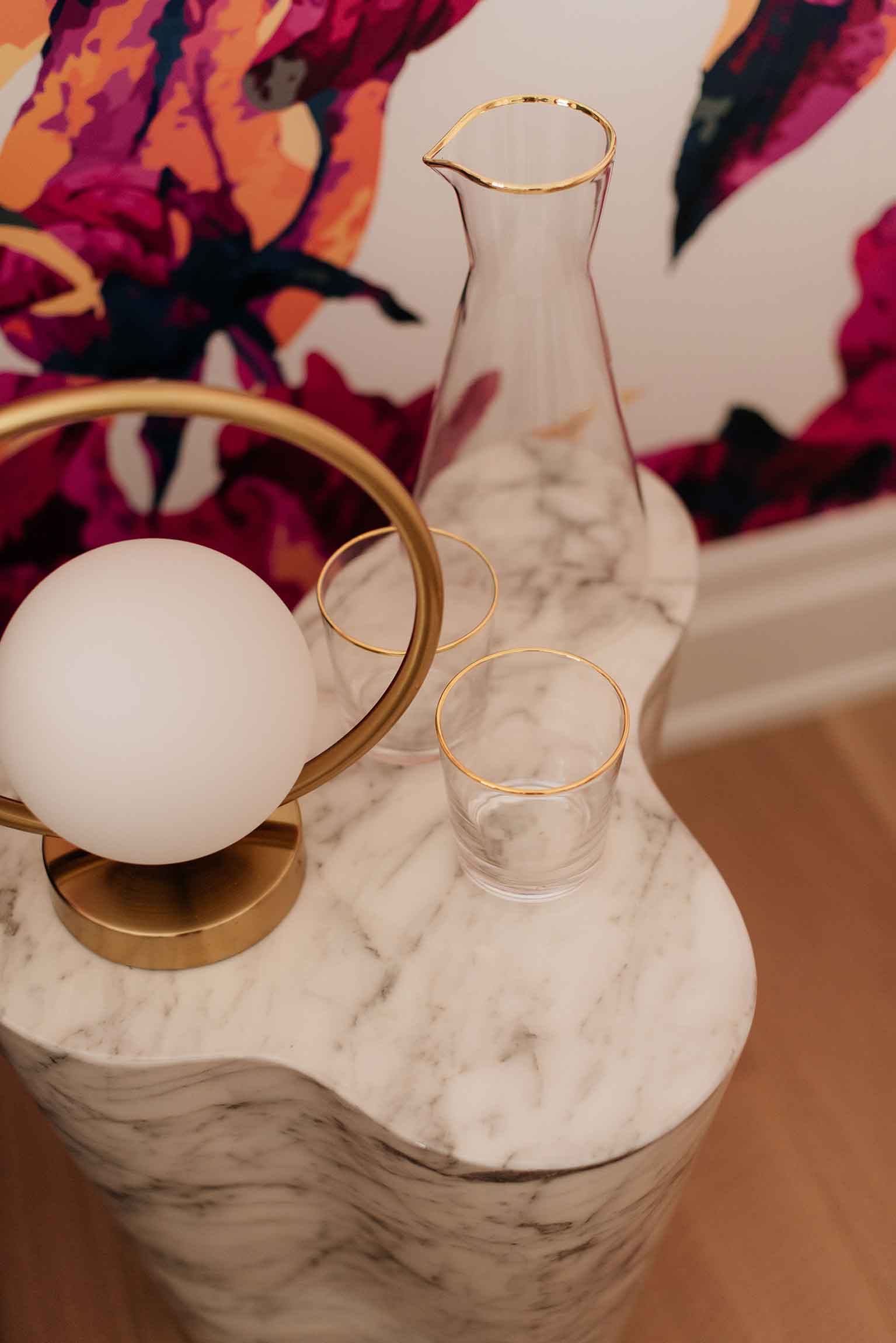
The side tables we used are also from Mobilia and I love how versatile they are. The room didn’t require any additional storage, so the ENAVA accent tables serve more of a decorative purpose and are the perfect spot for guests to put down their phones for the night, or keep essentials close by.
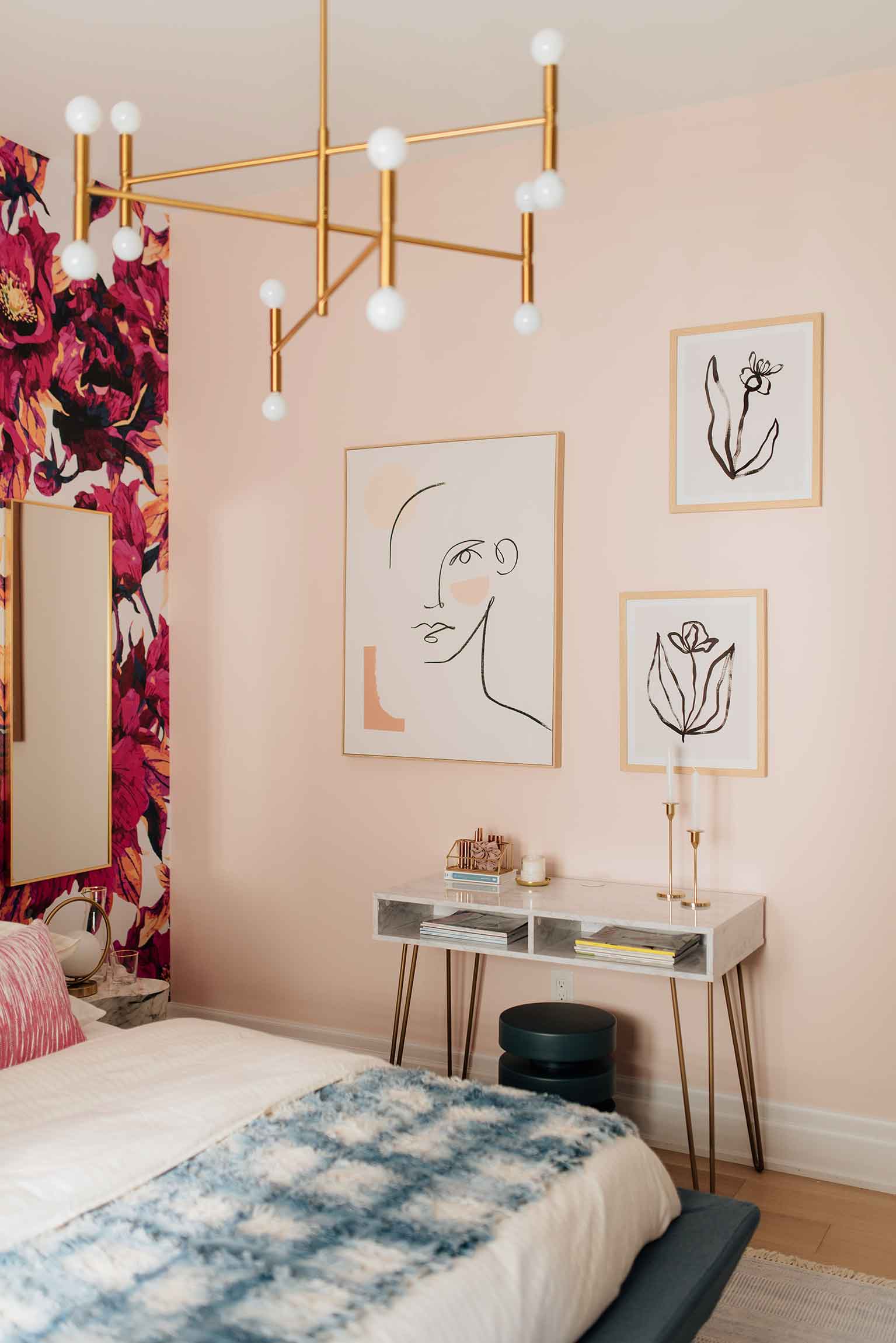
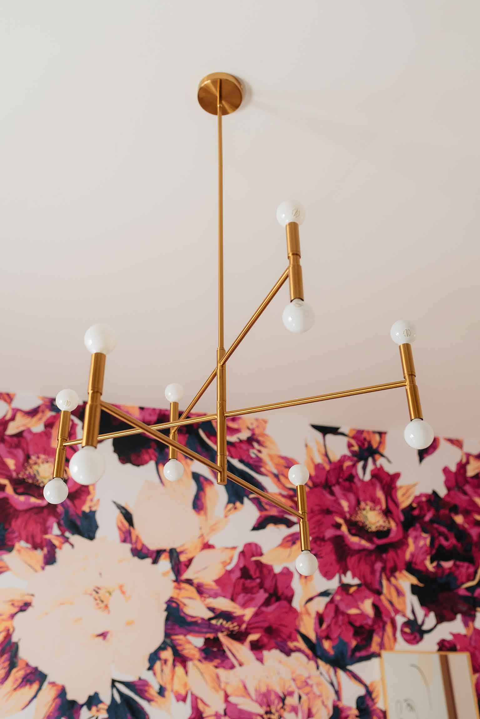
All the lighting in the room is from my go-to Dainolite who always seems to have exactly what I’m looking for. The large Ava Pendant in vintage brass certainly grabs your eye when you walk into the room, and the oversized Goliath Table Lamp mentioned above was just the piece we needed on the dresser to add height and really make everything pop against the dark navy wall. Did you also notice the cute Adrienna Lamps on each bedside table? They are just the right size and offer a ton of light when in use.
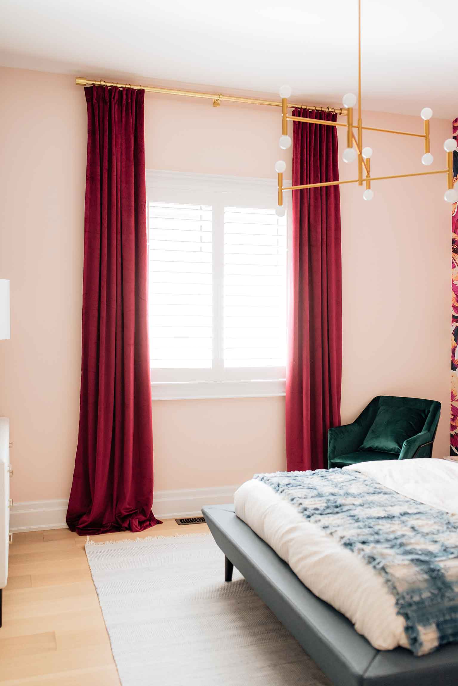
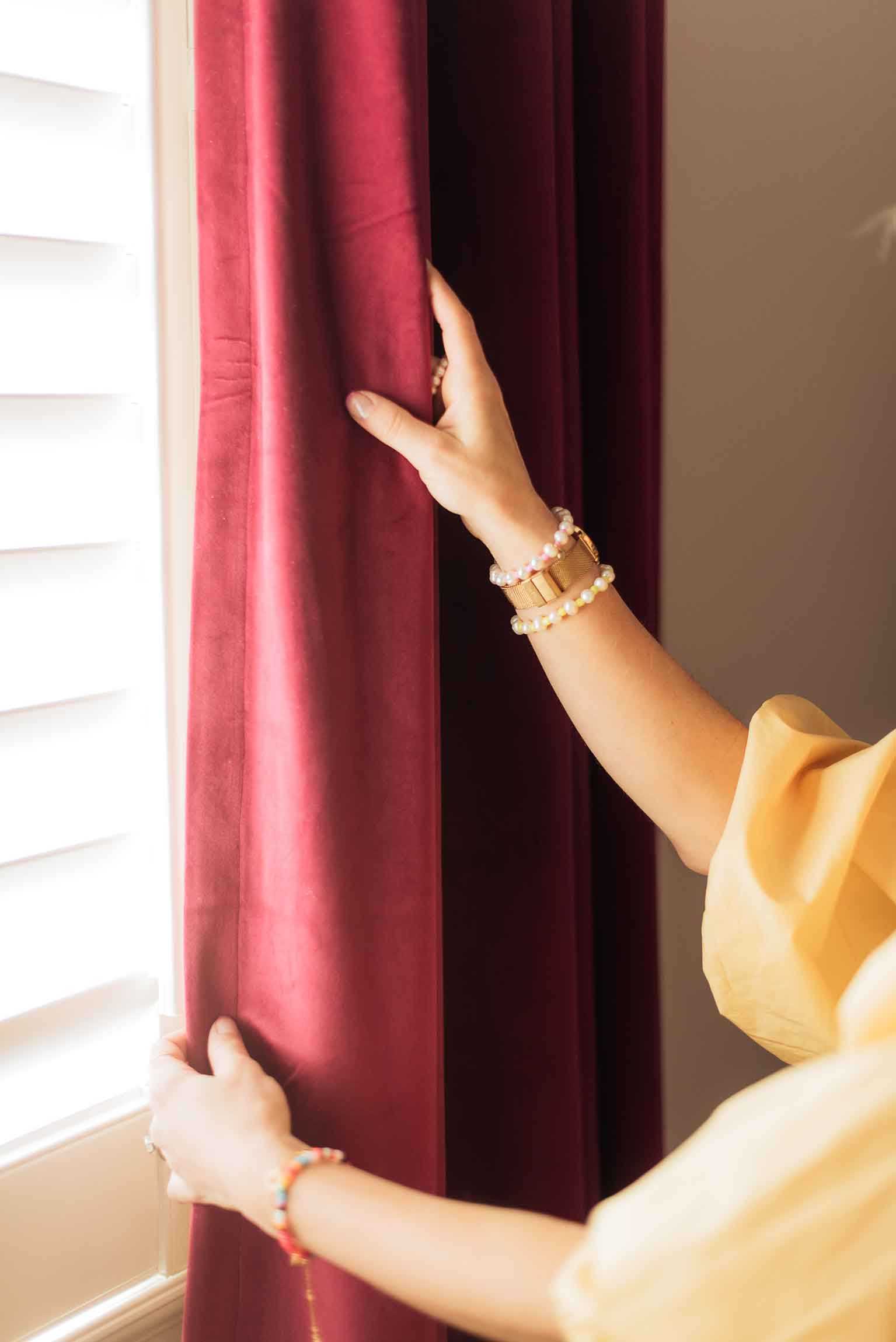
When it came to window coverings I wasn’t quite sure what I wanted to do here, and initially thought I may just use plain white curtains since there was so much else going on in the space. But after everything started coming together it became very clear to me that the drapery needed to make just as much of an impact as every other element in the room which is why I once again turned to Shirley from Pattern Homes for her luxury (yet affordable) custom velvet drapery. Shirley’s work is impeccable and this will be the third room we are using her fabulous drapery. They are always of the highest quality, her colour selection is spot on, and the finished product ends up adding that extra touch of luxury you didn’t know you needed!
I chose her Currant Drapery panels for this project and love how they pick up the darkest shades of fuschia from the wallpaper. They aren’t too pink or red, but look so luxurious and rich in this space. Absolutely in love!
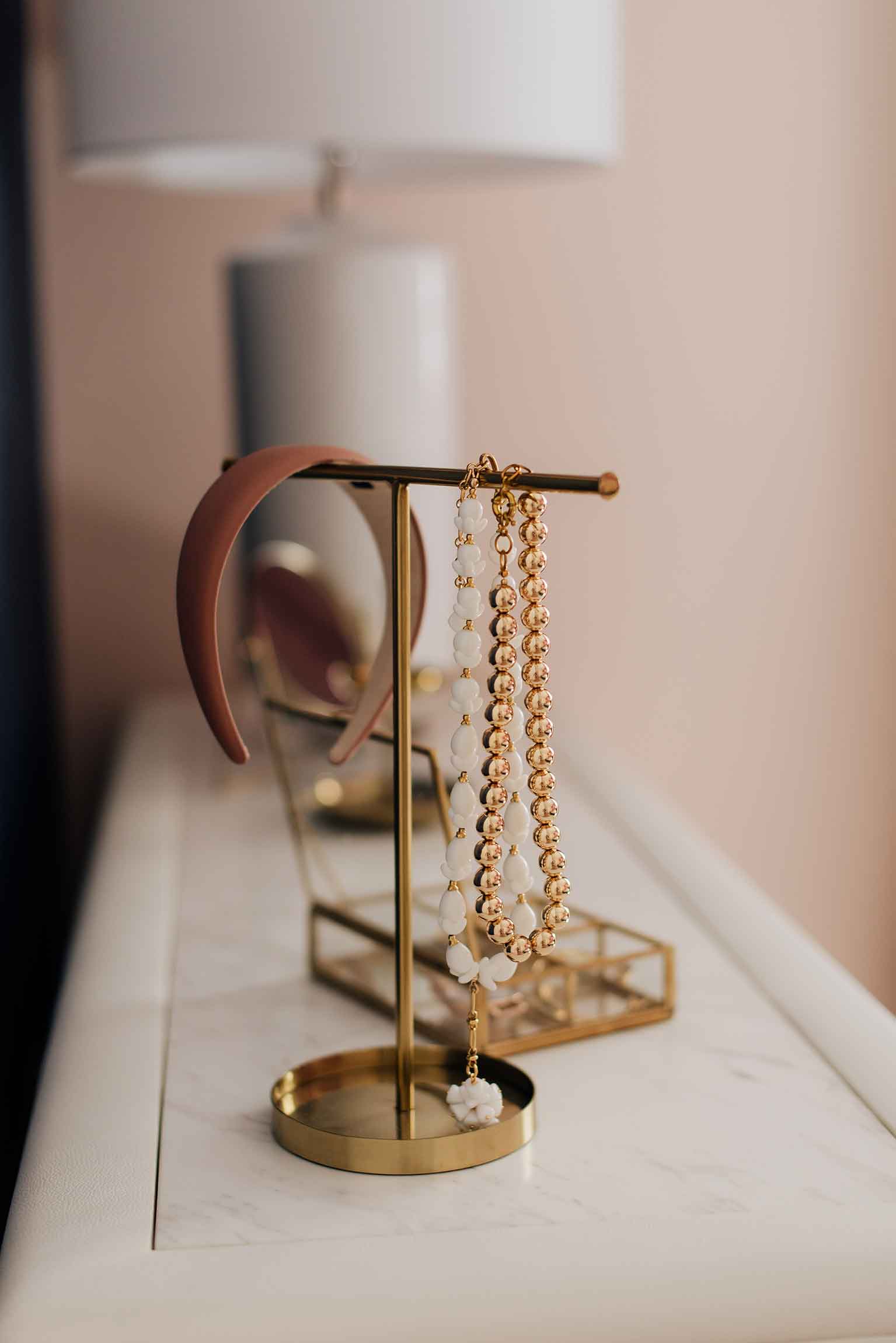
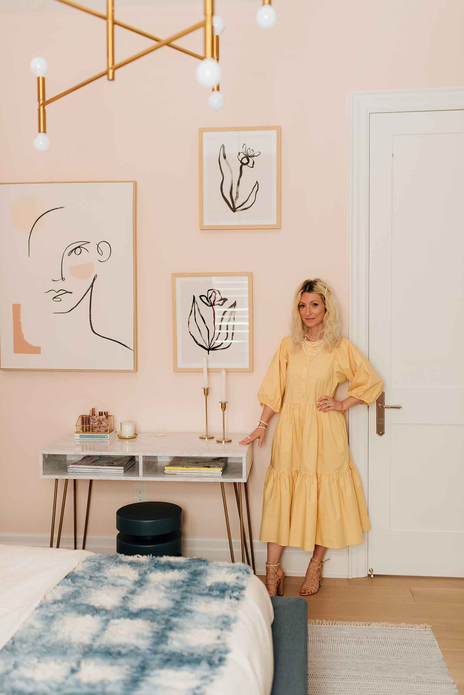
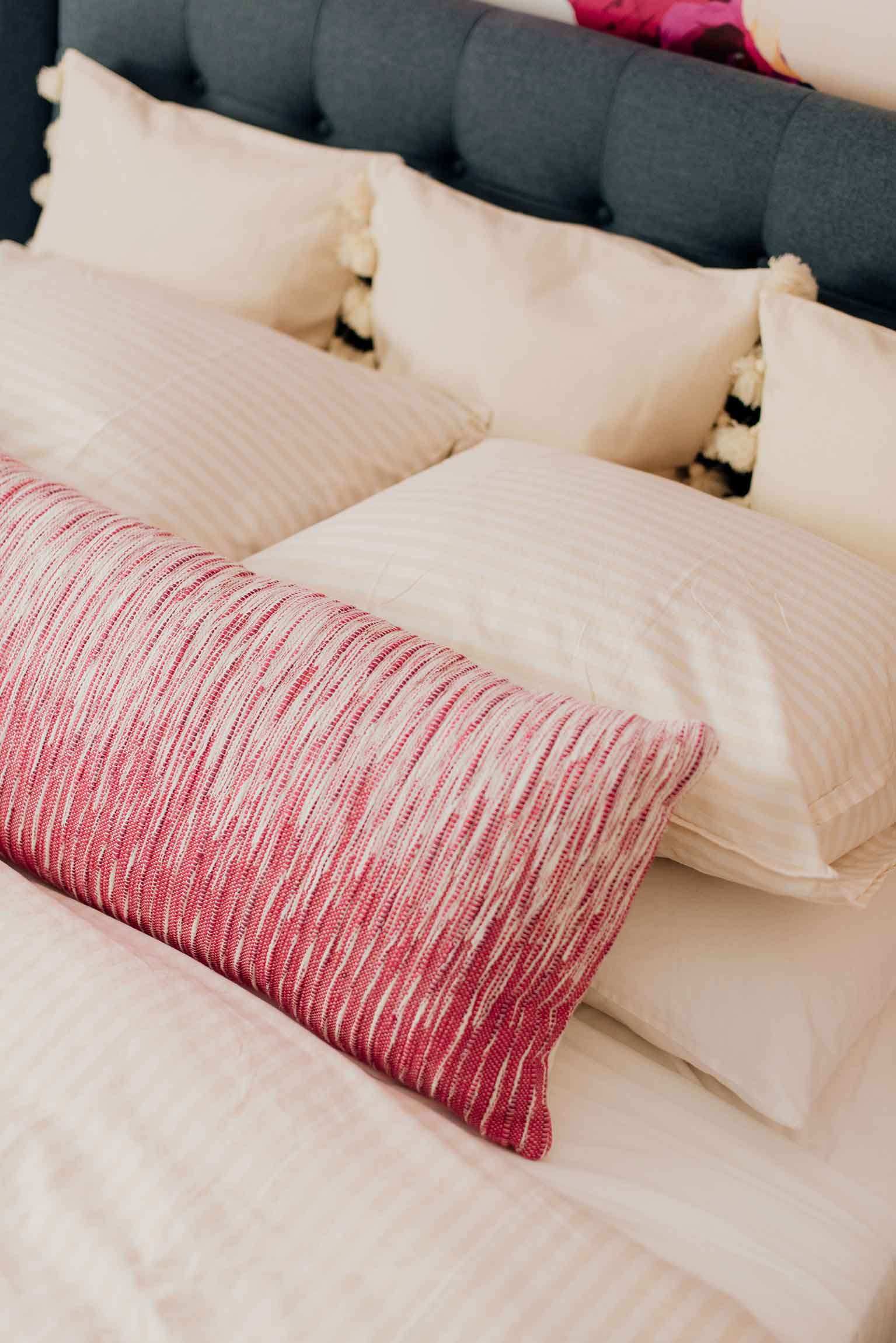
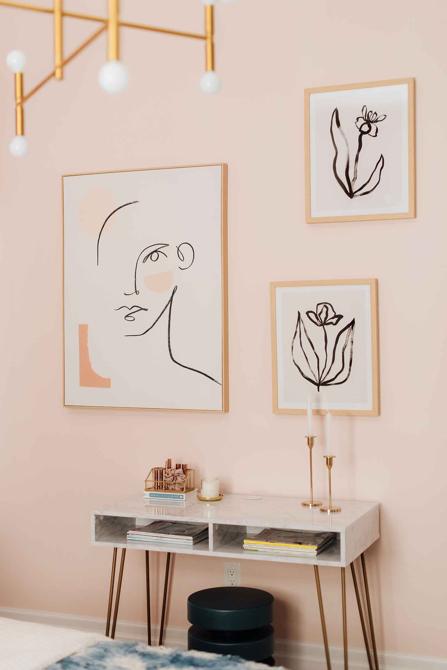
Once all the major design elements of the room were in place it was time to work on those final accents and decor that sometimes take the longest to complete. We accented the space with tabletop decor from H&M Home which is one of my favourite sources for affordable and stylish accessories. I also picked up the striped duvet set which is such a great contrast against the wallpaper, and the three accents pillows add depth and dimension to the final bedding look. All the wall art and mirrors are from HomeSense – which I was happily able to score right before we went into lockdown.
The desk was a last minute addition that I didn’t know I needed, but there was one wall that felt pretty empty and it needed something to really complete the room. I went with a simple, budget-friendly desk that guests could use to for work, or even as a makeup table. You may recognize the stool tucked under the table from a couple other rooms in our house and no I didn’t purchase multiples. It’s such a versatile piece that I just keep moving it around our home and I love how it slides right out of the way but is easy to use when you need it.
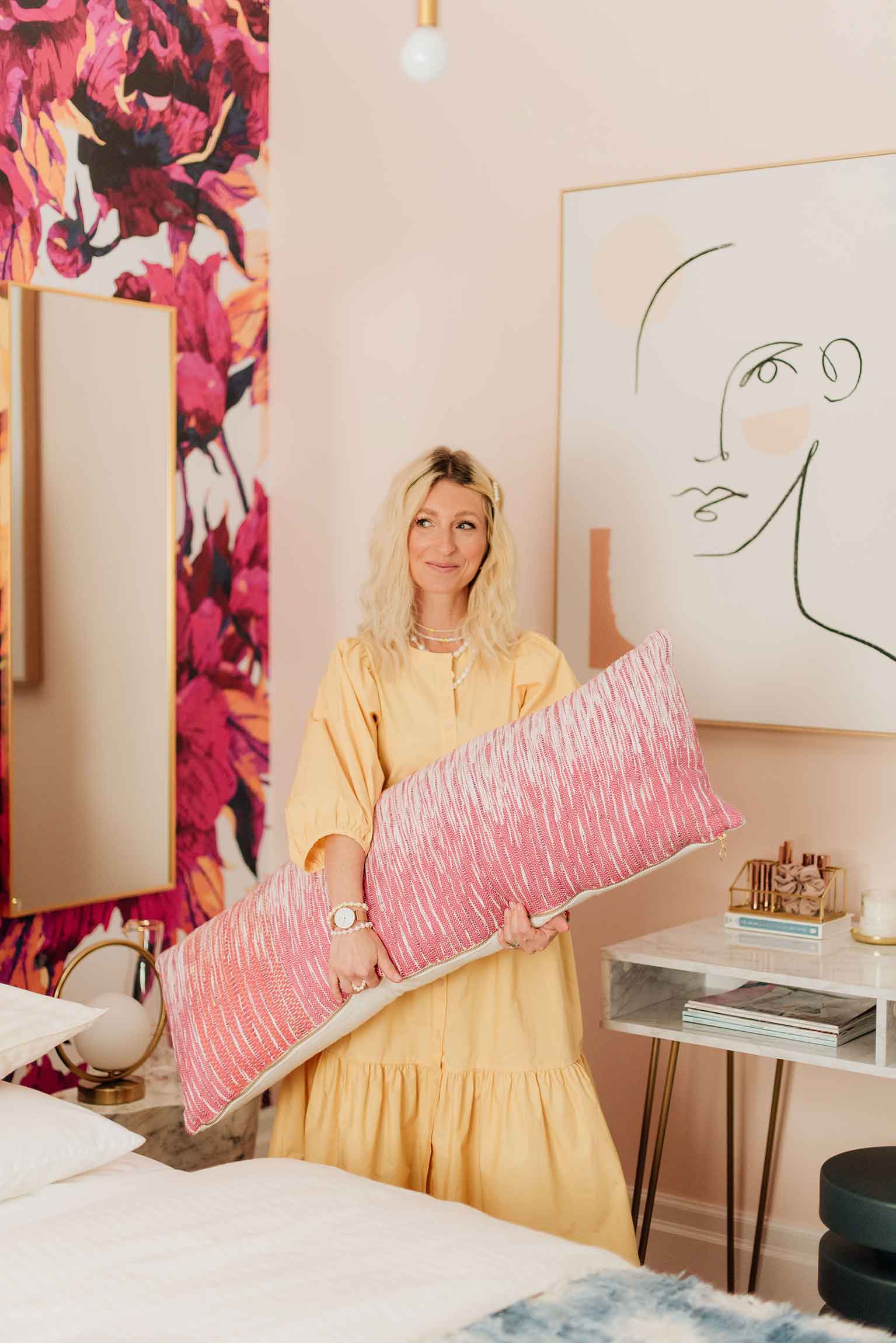
Making visitors feel comfortable in our home is so important to me! And now that our Guest Bedroom is complete, I feel an overwhelming sense of relief knowing that when lockdown is lifted (and I hope that’s very soon), we will have the perfect retreat for our family and friends that we can’t wait share with them!
SOURCE LIST: ℅ Mobilia: Bed, Dresser, Accent Tables | ℅ Livettes: Removable Wallpaper | ℅ Digby Paints: Slippery When Wet, Sunday Brunch | ℅ Dainolite: Pendant, Table Lamp, Pair Small Table Lamps | Drapery: Pattern Homes | Wayfair: Desk, Arm Chair | Rug: Structube | HomeSense: Mirrors, Artwork | ℅ H&M Home: Striped Duvet Set, Accent Pillows, Small Mirror, Necklace Stand, Jewelry Stand, Makeup Organizer, Candle, Jewelry Box, Candle Stick Holders | Water Pitcher and Glasses | Anthropologie: Throw Blanket, Lumbar Pillow | West Elm: Stool | Dress: ℅ Part Two
*Photos by Darby Mitchell Photography
*I partnered with a number of brands to bring this space together, however, all opinions are always my own.

